Fitness shirt design ideas: strong gym designs with attitude
A good fitness shirt needs a clear direction instead of generic dumbbells. These ideas make gym designs wearable, calm and still distinctive.
Many drafts for a fitness shirt fail not because of the design but because of a missing direction. If you simply type "dumbbell", you get a generic symbol on a black background that looks like every second piece of standard gym merchandise. A gym design gets stronger when you decide beforehand how the shirt should feel: plain, powerful, technical or urban. That one decision carries the whole design. Fitness belongs to the oldest form of deliberate physical activity, and a shirt may make exactly that attitude visible without getting loud. The designs are created in the Fitness & Gym sub-niche within the Sports & Leisure category.
Which fitness directions stay wearable
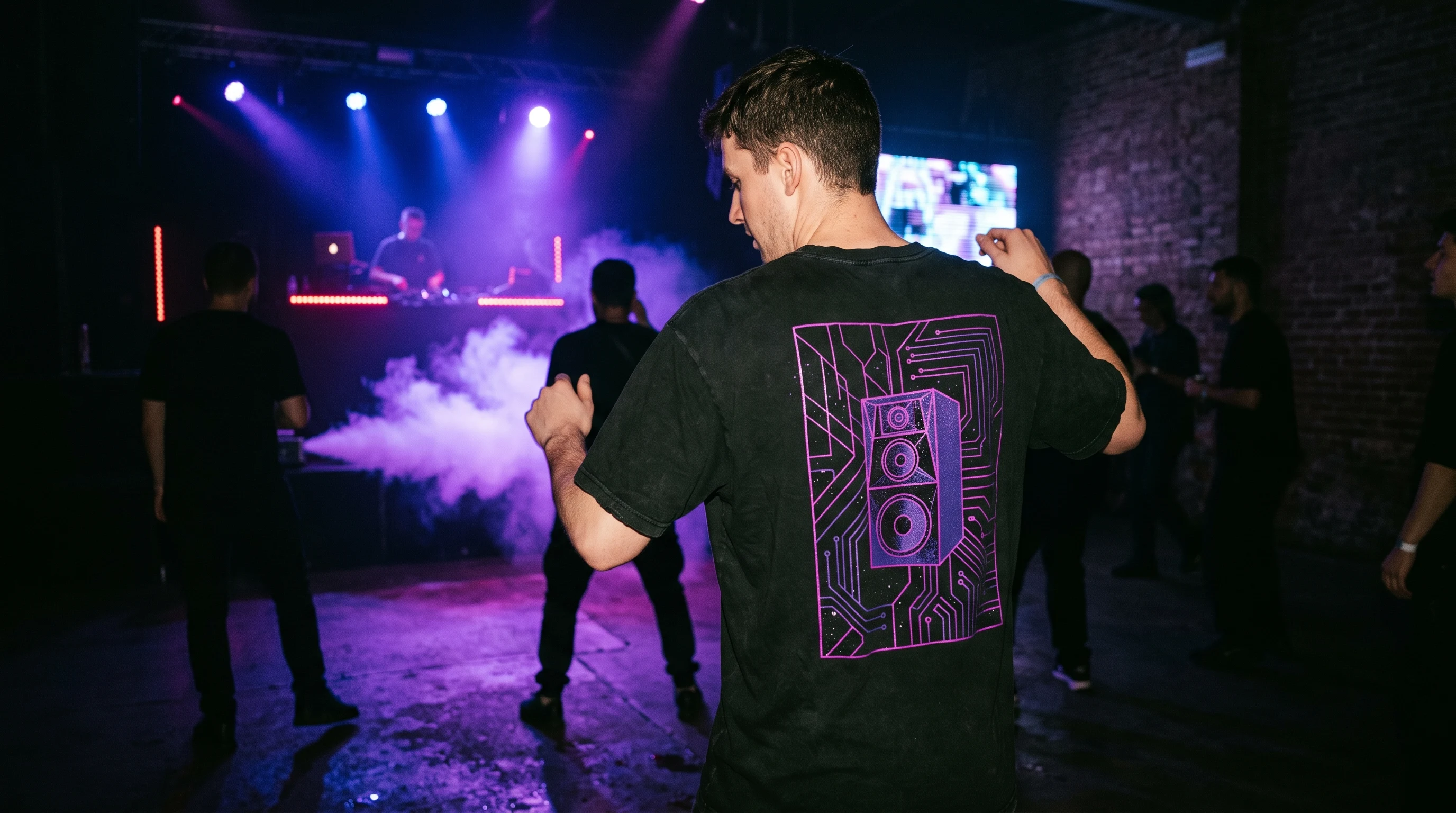
A good gym design lives on focus. A single, clearly placed symbol almost always convinces more than ten elements fighting for attention at the same time. Four directions work reliably in practice: plain dumbbell silhouettes, technical line work, short and pointed typography, and a dark, calm gym aesthetic. What they share is that they produce something wearable, something you can also put on outside of training.
Consistency matters: if you decide on a restrained, almost technical visual language, you should hold it and not mix in a second stylistic layer at the last moment. The shirt should make one statement, not three.
Ten design ideas for the gym and training
- Minimal dumbbell: a single dumbbell silhouette on the chest, in one color, with bold lettering like "LIFT" next to it. Plain, timeless, easy to wear every day.
- Anatomy outline: a muscle diagram in clean lines, the trapezius or the latissimus for example. Technical, almost medical and pleasantly matter of fact because of it.
- Strength training homage: a deadlift silhouette in black and red, plus a small accent like "RAW". More for fans of heavy lifting.
- Urban athletics: streetwear typography with a gym reference, black on white, with high contrast. Restrained in form, clear in what it says.
- Cardio lines: abstract heartbeat curves or running strokes. Light and dynamic, a good fit for runners and interval fans.
- Warrior design: a samurai silhouette with a dumbbell and sparing cherry blossoms. An unusual combination that works surprisingly well as a contrast (see also samurai shirt ideas).
- Calisthenics figure: a figure in a pull-up or muscle-up pose, boiled down to a black silhouette. Ideal for street workout.
- Technical drawing: a blueprint style with white lines on a dark blue background that ties anatomy and equipment together like a technical sketch.
- Functional panel: kettlebell, pull-up bar and box silhouettes as a graphic composition. For fans of functional training.
- One-word typography: a single strong word such as "FOCUS" or "DISCIPLINE" in large, calm lettering. Not a saying, a deliberate reduction.
Colors and composition in a fitness context
Visually, fitness designs carry above all in three color worlds. The first is an industrial, reduced palette of black, white and dark gray with a single accent. It looks timeless and ages slowly. The second works with high contrast, black and red for example, or black and a strong yellow, and suits younger, more outspoken drafts. The third stays muted: olive, navy, beige and a dark bordeaux give subdued athletic tones that look grown-up and close to everyday life.
For the composition one simple rule applies: give the main design room. A symbol that can breathe looks more valuable than a crowded surface. If you use text, it should support the design and not cover it.
Common mistakes in a fitness design
Most weak drafts fail on the same points. Too much text is the most common one: a whole line of strung-together motivational sayings drowns out any image. Stick to three words at most, a clear typeface and good contrast. The second mistake is worn-out motivational phrases that everyone has already read a hundred times. The third is airbrushed muscles without context that look tacked on, closer to a drugstore print than to a considered draft.
A strong fitness shirt shows attitude, not strain. It does not have to prove anything to anyone and therefore needs no overloaded visual language.
Which shirt type suits the design
The choice of material also decides how a design comes across and how it wears during training. A cotton shirt suits everyday gym styles and calm, flat prints well. It absorbs sweat but dries more slowly, which makes it better for relaxed sessions than for hard cardio.
The designer shirt with all-over print is made from a polyester-elastane blend and takes the design on every surface. The fabric moves moisture faster, and thanks to the sublimation process the print sits in the fiber itself. That makes it the right choice for deliberately large-area or louder drafts and for more intense sessions. You will find a sober comparison of both options on the pricing page, instead of getting stuck on individual amounts.
Many established gym labels rely on brand logos and standardized designs. The advantage is wide availability and a familiar style. The drawback: in the gym almost everyone ends up wearing the same thing. An individually created design goes the other way and turns the shirt into a one-off that was designed for you alone.
Recommendations by training type
- Hypertrophy and bodybuilding: a designer shirt with a powerful design such as an anatomy outline or a dumbbell. The fabric dries quickly, and the design stays clean even after heavy sweating.
- Functional training: a cotton shirt with a sparing design. When equipment knocks against you and things get rough, the shirt should be plain and uncomplicated. Kettlebells or box silhouettes work well.
- Strength training and heavy lifting: for the session itself a close-fitting, reduced design works. Official competitions, however, have their own equipment rules, which you should always check with the relevant federation instead of relying on an everyday shirt.
- Running and cardio: fast moisture transport matters here, so the polyester shirt. Designs such as cardio lines or slim running silhouettes underline the movement.
- Urban gym style: a graphically strong or streetwear-oriented draft on the designer shirt. The design may be clear, the cut loose.
Audience and occasions
Ambitious amateur athletes between their mid-twenties and mid-forties wear their fitness shirt in the gym, doing cardio, in the park or under a hoodie. Wearable, restrained designs work best for them, because the shirt should accompany them and not shout for them. Younger lifters are more open to clear statements, urban cuts and crossover drafts with anime or gaming influences.
Coaches and trainers often use shirts as a visible identifier in their social channels. What counts here is a legible design that also works on small preview images. Competitors, in turn, often look for themed event shirts with a clear atmosphere, for strength meets or functional competitions for example.
Gift scenarios for fitness enthusiasts
A good gift shirt shows that someone thought along. A draft tuned to the actual training feels noticeably more personal than a generic design off the rack.
- A birthday for a training partner: a premium cotton shirt with an individual design, matched to his discipline. Whoever lifts heavy gets a deadlift silhouette, whoever trains functionally gets a kettlebell.
- Matching shirts for the gym: two designs tuned to each other with small differences, a dumbbell on the left and on the right for example, or two complementary designs that round each other out.
- A gift for a coach: a designer shirt that makes the training philosophy of the gym visible without tipping into advertising.
- A start for gym newcomers: a cotton shirt with a motivating but not corny design. A single symbol or a short word convinces more credibly here than a whole phrase.
For delivery by a fixed date such as Christmas, plan around 15 business days and order early enough.
Care for sweat-heavy sessions
Fitness shirts take more of a beating than everyday clothing: sweat, frequent washing and the occasional chalk dust all challenge the fabric. So wash the shirt at 30 degrees inside out and skip fabric softener, which can reduce breathability. The dryer is off limits, because cotton shrinks and the elastic share of the designer shirt suffers under heat.
If you cannot wash right away, rinse the shirt briefly with cold water straight after training. That prevents dried-in salt rings. You should not iron it, since the fabric loses its shape under heat sooner than the print loses its color. Further notes are in the FAQ.
In the end clarity decides. A fitness shirt that picks one direction and holds it consistently gives a more confident and more valuable impression than any overloaded draft. If you have an idea, try it out in several variants in the design generator, look at the gallery to see how tidy designs work in practice, and compare the options calmly via the pricing page.
FAQ
Which material is better suited to intense training?
For hard cardio or sweat-heavy sessions the polyester-elastane shirt is the calmer choice, because it moves moisture faster and dries more quickly. Cotton absorbs sweat well but dries more slowly and suits relaxed sessions and everyday wear better.
How much text should a fitness design contain?
Less is reliably better here. Three words at most, a clear typeface and high contrast are enough. A single strong word usually works more convincingly than a whole line of strung-together sayings that cover the image.
Can I wear a fitness shirt outside of training as well?
Yes, and that is exactly what reduced designs aim for. A calm dumbbell silhouette, technical line work or a short word can be worn in everyday life without a problem. Very loud or large-area drafts, on the other hand, stay better suited to the gym and to deliberate occasions.
What should I look out for in a shirt for competition?
For normal training a close-fitting, reduced design is enough. Official competitions have their own equipment rules on material and cut, depending on the discipline. These are set by the respective federations, which is why you should check them there before you register.