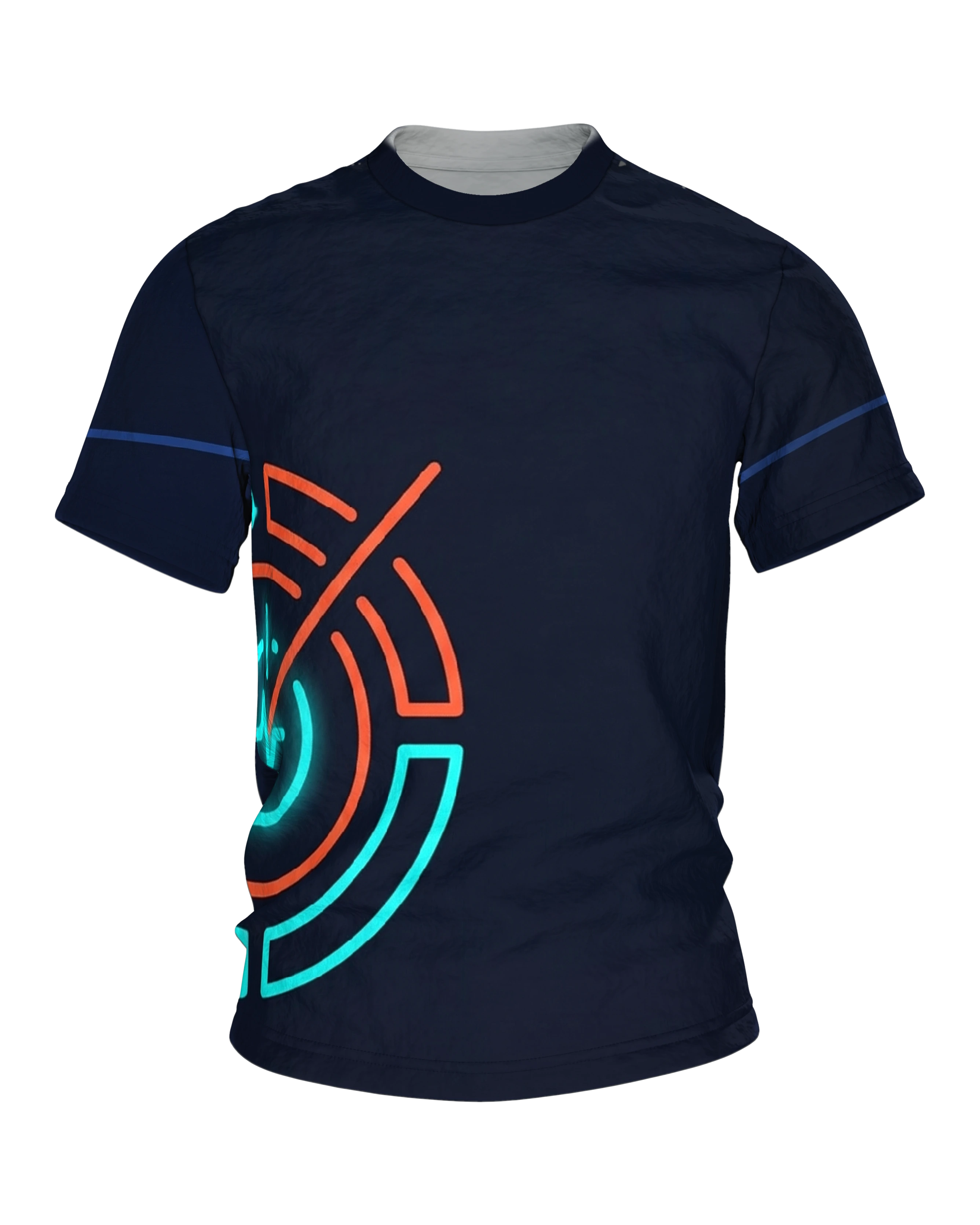
At the lower left, on a midnight blue ground, sits a ring of turquoise and orange-red segments, a pulse line at its core and a long hand running across it. At the nape, the same sign appears small and entirely in turquoise.
Product description
The Neon Interval Timer T-shirt does not place its sign across the chest, but low on the left, where the side of the body begins. There, on a midnight blue ground, lies a ring of glowing segments whose outer tracks run past the side edge. Below it, a wide unprinted area remains before the fabric ends.
At the core sits a closed turquoise circle. A pulse line runs horizontally through it: a sharp spike upward, then a deep pull downward, then calm again. Above it stands a vertical stroke with a small dot beside it, like the zero mark on a dial.
Several ring tracks wrap around this core. Each one is broken into segments, each has gaps along the diagonals, and going outward they alternate between turquoise and orange-red. The arcs grow longer and flatter as they go, until the outermost ones are cut off at the edge of the printed area.
A long orange-red hand runs across all of it. It starts at the center, crosses every track and ends freely in the dark fabric, angled up to the right. This single diagonal breaks open the order of the circles. Without it the design would be an ornament; with it, it becomes a measurement.
The whole thing is drawn in a single line weight, with rounded ends, no filled shapes and no numerals. Every line carries a soft halo that fades into the ground, the way a neon tube glows against a dark wall. That glow is painted, not an afterglow in the dark.
On the back the same sign returns, this time complete and in a single tone. Small, about a hand's width, it sits high up beneath the neck seam: the whole ring, every segment, the pulse line and the hand, all in turquoise. The rest of the back stays empty.
The sleeves are not left untouched. A narrow band runs around each of them, muted steel blue in the middle and lightened to clear turquoise at both ends. From a distance it reads as a stripe, up close as a continuation of the same glowing script.
Anyone who trains in intervals understands the ring without explanation. Segments are rounds, gaps are breaks, the hand separates one from the other. Forty seconds of load, twenty seconds of air, then from the top. The line in the middle says what it is really about.
Three tones carry the entire piece: midnight blue as the ground, turquoise as the lead color, orange-red as the counter voice. This is the color language of displays and clockwork at night. It holds up because nothing interferes and because the area all around stays dark and quiet.
The design is meant for people whose week breaks down into units. For the runner who counts rounds and breaks in her head. For the strength athlete whose watch knows more starts than his calendar knows appointments. For class instructors who call out the switch while everyone else is gasping.
The low placement has a sober advantage. Under open jackets and vests the ring stays visible where centered chest prints have long since disappeared. During training it sits below the zone where belts and straps run, and does not get in the way of a single movement.
The design looks calmest next to black and dark gray, leaving turquoise and orange-red as the only bright points in the picture. If you like, pick up one of the two colors again on a shoe or a cap, and the whole look appears deliberate.
What remains is an image that does not wear out as you look at it, because nothing in it is placed by chance. The ring counts nothing and measures nothing. It only reminds you that after every break the next round comes, and that is entirely enough.