Women's yoga shirt: unique designs with calm
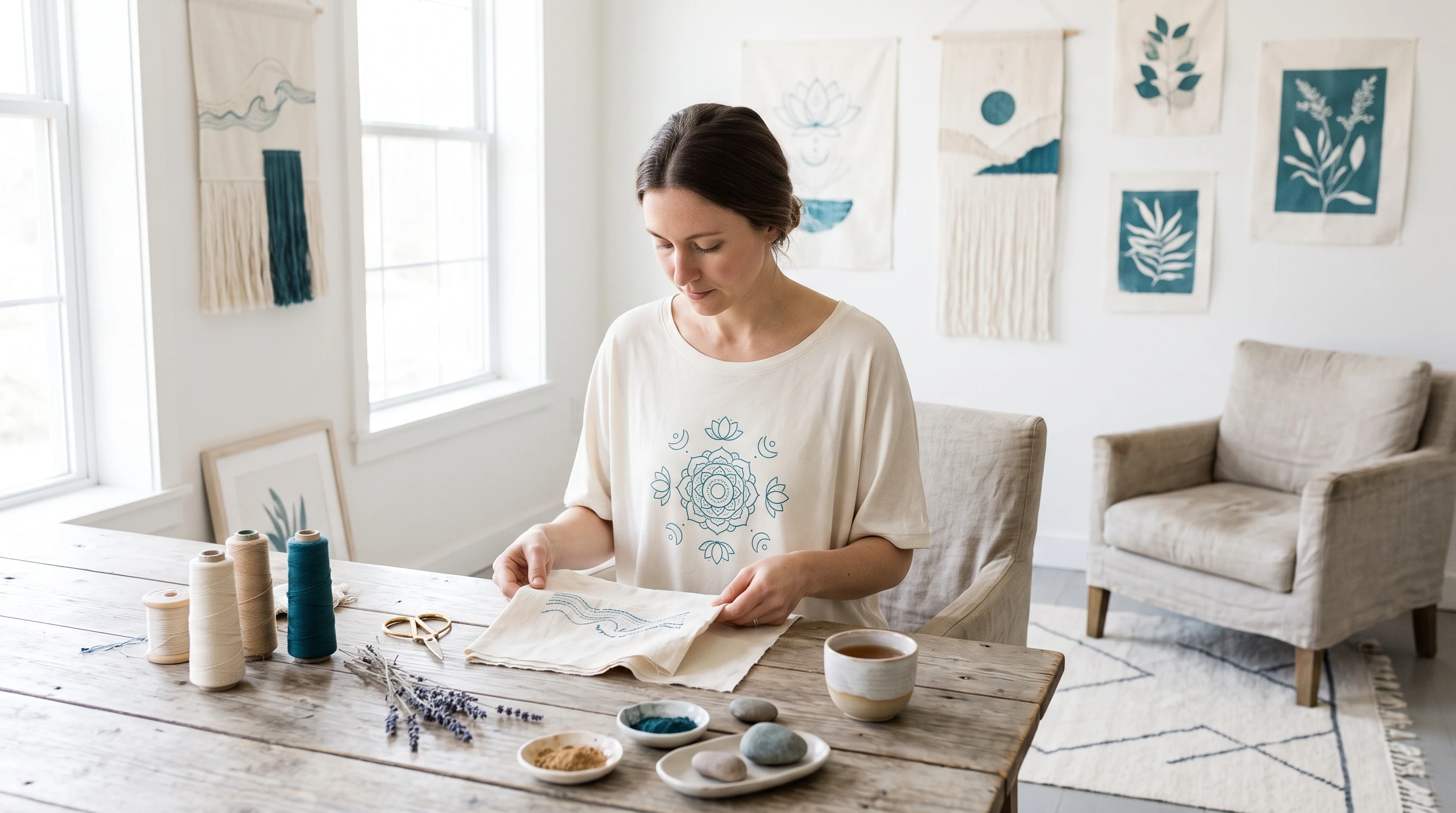
A women's yoga shirt with a calm effect: design ideas, a fitting color world and the right cut for a unique design that works every day.
A good women's yoga shirt does not live on showing as many spiritual symbols at once as possible. It lives on a calm decision you make early: pared back, natural, graphic or quietly artistic. That clarity is what makes a yoga design grown up and wearable instead of overloaded and esoteric. For a unique design to emerge, it pays to settle two things before the first design: which mood the shirt should carry and in which moments you will put it on. Almost everything else follows from those two answers almost by itself.
Which design directions carry a yoga shirt
Lotus, mandala, nature designs, calm geometry and meditative symbolism are among the directions that make a yoga design look grown up. A fine lotus line reads pared back and everyday, an elaborate mandala artful and meditative, and nature designs like the moon, mountains or leaves radiate something grounded and connected. What matters is that a design gets to breathe and does not try to tell everything at once. So decide early whether it should lean pared back or artful. Both routes are convincing, they simply lead to very different shirts.
Design ideas that feel calm and personal
These approaches work well as a starting point for a design of your own:
- A fine lotus line as a pared back main symbol, with plenty of fabric left free.
- A symmetrical mandala in muted tones, set centrally and artfully.
- A moon or mountain design with clear, sparing line work.
- Geometric patterns in the spirit of sacred geometry, in a quiet color world.
- A nature design such as leaves or waves, broad and softly laid out.
Every one of these ideas can be refined as far as you like: a delicate line of lettering underneath, a single color accent, an unusual placement. That is how a familiar shape becomes a piece that exists in this combination only once.
Color world: why quiet palettes win
Yoga designs unfold their calm through restrained colors. Earth and beige tones read natural and warm, muted green and sage soothing, black and white with a single delicate accent refined and clear. Harsh contrasts quickly rob a quiet design of its effect, because the eye then jumps to signal colors instead of to the shape. Two or three coordinated, rather subdued tones carry a yoga design better than a colorful mix in most cases. A good test: if the palette recalls an early morning rather than an advertising poster, it is usually the right choice.
Cut and shirt type for women
This is where the women's side gets concrete. A close fitting shirt emphasizes the silhouette and sits securely on the mat without riding up. A straight, loose cut feels more relaxed and gives more freedom of movement in everyday life. Both are coherent, it is a question of style and not of rules. With the material, this gradation is worth knowing:
- A breathable cotton shirt is a reliable start for practice and everyday wear, unobtrusive and pleasant to wear.
- A premium shirt feels more valuable and suits a piece that should be special or is meant as a gift.
- A designer shirt pays off for deliberately artistic, full surface designs, for example a large mandala running across the front.
It is best to settle the color world and the shirt type before you decide on the exact design. A full surface design needs a different cut than a fine symbol on the chest, and this order saves you corrections later.
Common mistakes that destroy the calm
The most common mistake is symbol overload: lotus plus mandala plus om plus chakra plus lettering in a single image. The result feels hectic, so the opposite of what yoga conveys. Too many harsh colors disturb the quiet as well. Another stumbling block is a design that only looks right on the mat but seems out of place in a cafe or an office, so the shirt rarely gets worn. The solution is almost always the same: one clear main symbol, plenty of room around it, a subdued palette.
What lotus, mandala and moon mean
Many yoga symbols carry a meaning that gives a design more depth. The lotus stands for purity and for growing out of difficult ground, the mandala for wholeness and concentration, the moon for calm and natural cycles, sacred geometry for the order behind visible things. Choosing a symbol deliberately for its meaning gives you a more personal shirt, without it having to look esoteric. That choice also helps with paring down: a single sign that truly fits your own practice carries more serenity than a collection of spiritual symbols.
From the mat into everyday life
A good yoga shirt convinces not only in the studio but also before and after, on the way to class, in the cafe, at home. For that to work, a restrained design helps: a fine symbol, a calm color world, a pleasant fabric that moves with you. With the material, look for comfort and breathability, with the cut for freedom of movement. That way you do not have to choose between functional clothing and a favorite shirt, because the one piece can do both without being out of place in either moment.
As a gift: a calm one-off
A yoga shirt is a considered gift for people who value mindfulness and inner calm. Unlike accessories, which quickly turn up twice, a personal design speaks to the attitude behind the practice. When giving one, it helps to know the favorite color or a preferred symbol of the person receiving it, a lotus, a moon or a plain geometric shape. With a restrained palette and a pared back design, what comes out is not some generic wellness product but an individual piece that fits the person.
How to go step by step
- Start in the Sports & Leisure category, in the Yoga & Wellness area.
- Decide on a direction: pared back, natural, graphic or artistic.
- Settle the color world and the shirt type.
- Describe your design and compare several variants at your own pace.
Every design is created individually and becomes a personal one-off. If you have an idea in mind, you describe it in the design generator in your own words and get several drafts to choose from. For a first impression it is worth a look at the gallery, and which edition suits your design is shown on the pricing page.
FAQ
Which cut works better for a women's yoga shirt, close fitting or loose?
That depends on the style and on where you wear it. A close fitting cut emphasizes the silhouette and sits calmly on the mat without riding up. A straight, loose cut feels more relaxed and gives more freedom of movement in everyday life. Both are coherent, it is not a question of right or wrong.
How do I keep a yoga design from looking esoteric?
Pare it down to one clear main symbol with plenty of free space and a quiet color world. If you also pick a sign deliberately for its meaning instead of stacking several symbols, you get a more personal and calmer result that reads grown up rather than spiritually overloaded.
Which colors suit a calm yoga shirt?
Restrained palettes usually carry a yoga design best: earth and beige tones, muted green or sage, or black and white with a single delicate accent. Two or three coordinated, rather quiet tones look more coherent than a colorful mix with harsh contrasts.
Does a yoga shirt work as a gift?
Yes, above all for people who value mindfulness and calm. It helps to know the favorite color or a preferred symbol of the person. With a restrained palette and a pared back design you get an individual piece instead of some generic wellness product.