Martial arts shirt: octagon, fists and the art of the moment
MMA and martial arts on a shirt: three visual directions beyond the clichés, ten design ideas and clear rules for colors, placement and fabric.
Martial arts merchandise has a cliché problem: skulls, flames, block capitals, plus a predator baring its teeth. Anyone who trains themselves recognizes little of that. Because at its core, martial arts is not aggression, but timing, discipline and one decisive moment. That very moment is the strongest design a shirt can carry.
That applies to mixed martial arts as much as to boxing, Muay Thai or BJJ: every discipline has its own images, its own body language and its own quiet moments. A shirt that tells of this needs no teeth and no flames. It needs a decision about which facet of the sport it should show.
The moment beats the symbol
A good martial arts design does not start with symbols, but with a question: which instant should be frozen? The second before the high kick, when both fighters stand still. The takedown, where everything tips. The brief touch of the gloves before the first round. Think like that and you get a design with tension instead of decoration.
Three visual directions for MMA and martial arts
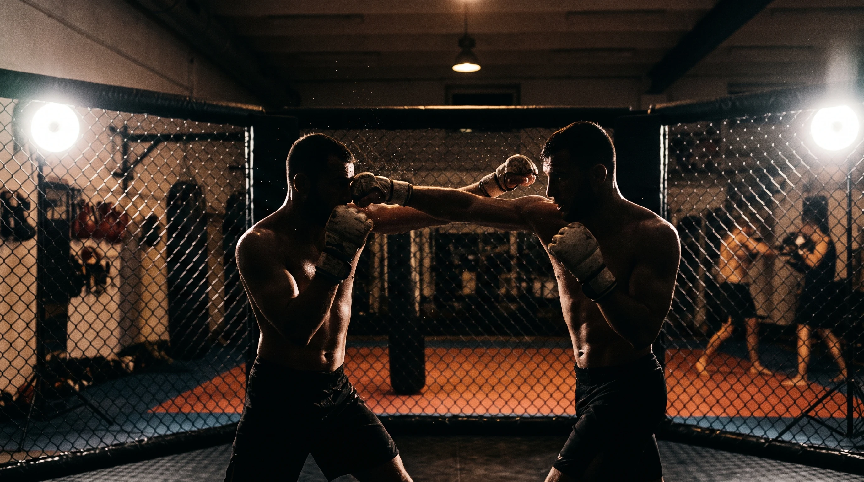
The documentary scene. Two silhouettes in the octagon, monochrome in gray and black, behind them bursting structures like shattered glass. This direction lives on drama and reduction at once: few colors, a lot of movement, one clear focus. In the gallery one design shows exactly that, two fighters in the kick moment in front of a splintering cage, entirely in shades of gray.
The narrative storyboard. A fight can be told like a comic: panels in ink, each tile a fragment, together a whole fight. As an all-over print the shirt becomes a canvas, the build-up at the front, the decision at the back. Burgundy, black and white carry this style particularly well.
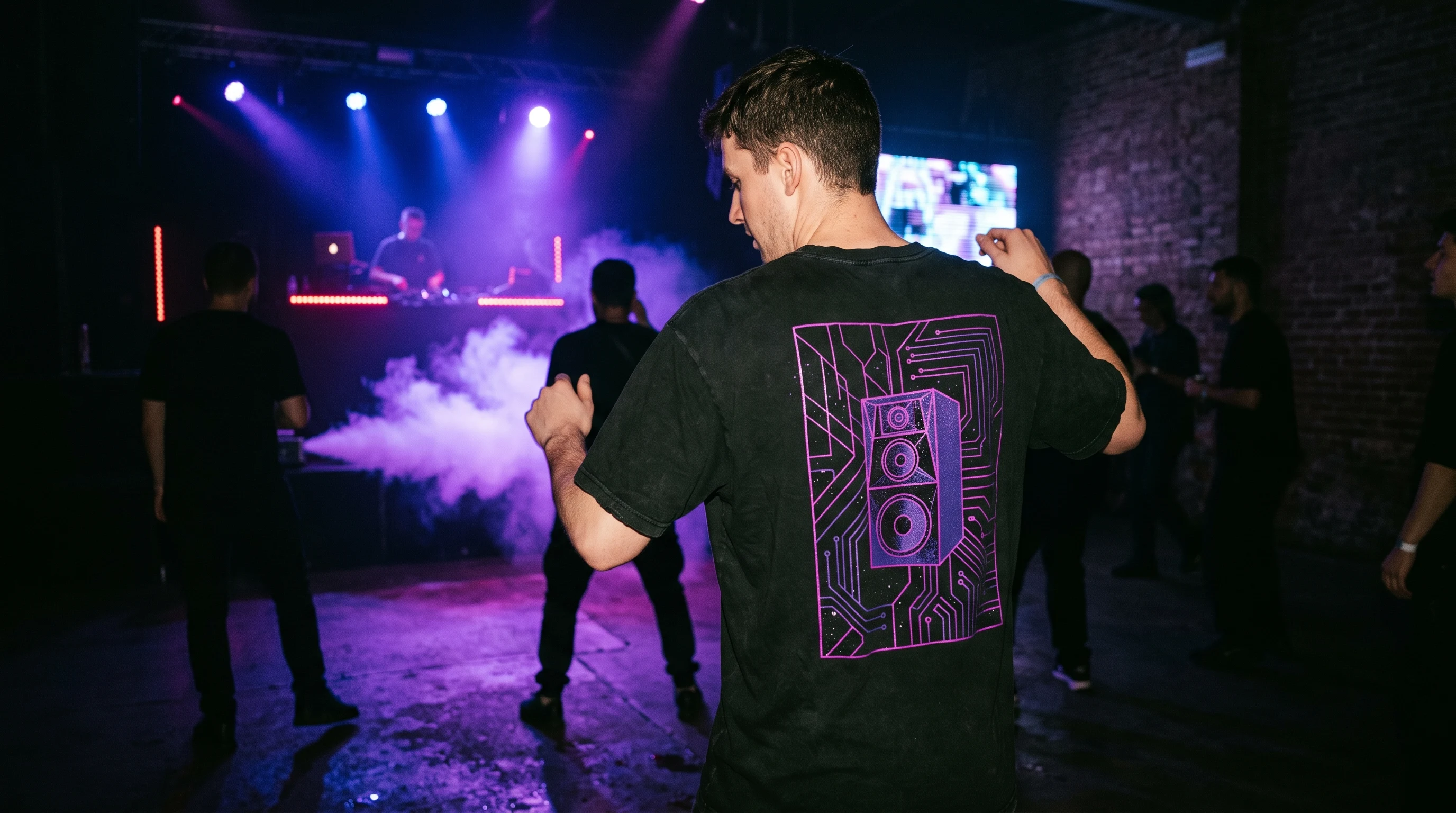
The abstract energy. The third direction leaves figures out entirely: woodcut swirls, splintering shapes, lines that translate movement without showing a single punch. Designs like these work in everyday life too and only reveal themselves as a martial arts shirt at second glance.
Ten design ideas for your martial arts shirt
- Octagon as a grid: the cage not as a backdrop, but as a graphic pattern across the whole shirt.
- The clinch in ink: two bodies, one shape, drawn with a few strong strokes.
- Muay Thai in temple light: the show of respect before the fight, mist, warm light, more ritual than fight.
- Boxing gloves on the nail: the quietest boxing design there is, melancholic and proud at once.
- BJJ as a one-line drawing: ground fighting as one continuous line, minimalist and technical.
- Bursting octagon: abstract shards and pressure waves, energy without depicting violence.
- The count as typography: eight, nine, ten, large numerals with texture, dramatically set.
- Fist as a negative shape: the outline emerges from what is missing, strong on a single-color background.
- Sparring in backlight: two silhouettes in the dust of the gym, documentary and calm.
- Your gym motto in block letters: hard typography with structure, your own sentence instead of a standard slogan.
Colors, placement, fabric
Monochrome scenes work on light and dark shirts. Ink storyboards need surface and therefore all-over print. Abstract woodcut designs look like fine art prints on cream and natural tones. As a rule of thumb: the more narrative the design, the more surface it should get. The more reduced it is, the better a small chest emblem works too.
With the colors, restraint pays off. Martial arts designs tip into the garish quickly, yet it is the reduced palettes that carry the tension: shades of gray with a single accent, burgundy with black and white, sepia and ink on natural tones. If you want to wear your shirt outside the gym as well, these combinations work far better than neon on black.
For the gym, as a gift, for fight night
A self-designed martial arts shirt has three natural occasions. For your own training: the motto that carries you through the hard sessions, as a design that fits only your story. As a gift: if you know the discipline, the favorite technique or the nickname of a training partner, two sentences describing that make a very personal present. And for fight night in front of the TV or in the arena: a design that carries the tension of the evening without needing a single federation logo.
One important point: use your own words, mottos and names. Protected logos, federation names or portraits of real fighters do not belong on a self-designed shirt.
Three mistakes almost every martial arts shirt makes
The first mistake is overloading: fighter, cage, lettering, flames and emblem on one surface. A strong design settles on a single element and gives it room. The second is the wrong perspective: poses set up frontally look static, like a club photo. It gets interesting from the side, cropped or in backlight, where the movement stays visible. The third mistake is arbitrariness in the text. Standard slogans sit on a thousand shirts; your own sentence, a date or a place name from your training history beats any platitude. If you are unsure, leave the text out completely at first: a design that works without words only gets stronger with a good sentence later.
From thought to shirt
At Isakum you describe your design in one sentence, for example "two fighters in the octagon, the moment before the high kick, monochrome and dramatic", and the AI creates several complete designs from it for the front and the back. Every design is created uniquely for your description, no design is like another. On the page design your own MMA T-shirt you will find the direct entry point, in the MMA Octagon design world real examples, and in the gallery all finished one-offs at a glance.
FAQ
Which martial arts disciplines can the AI handle?
All of them that you can describe: MMA, boxing, Muay Thai, BJJ, wrestling, karate or judo. Name the discipline, the technique and the mood, and the AI renders the characteristic stances.
Does a martial arts shirt work as a gift?
Very well, above all with a personal connection: the favorite discipline, the gym motto or the fight name. Describe the design in the wizard and order it in the right size, production happens on demand in Europe.
All-over print or chest design?
Storyboards and cage grids need the whole surface, so all-over. Reduced silhouettes and negative shapes also carry as a small chest design. When in doubt: generate both versions and compare them directly on the shirt.