Samurai shirt design ideas: Japanese designs with poise
A samurai shirt works best with a clear direction: calm, historical or graphic. Here is how you build Japanese-inspired designs cleanly and in a grown-up way.
A good samurai shirt rarely fails on the design, but on the quantity: katana, mask, armor, cherry blossoms and characters on one chest add up to visual crowding instead of poise. The theme gets stronger when you decide early whether your design should feel calm, historical or graphic, and then hold exactly one of these directions cleanly. The visual language of the samurai lives on discipline, and that discipline carries over best when the shirt bears one idea instead of five. If you want to understand the background of the warrior class, Samurai gives you the historical frame that lends many designs their depth.
A clear starting point helps enormously. Do you want a quiet, contemplative scene with falling cherry blossoms? An angular warrior pose against a dramatic sky? Or a purely typographic approach to the Bushidō idea? The more precisely you set this out in advance, the more precise the first drafts become. Samurai designs are created at Isakum in the sub-niche Samurai & Feudal Asia within the History & Myths category.
Which visual language carries a samurai design
Three visual families work particularly reliably, and they differ not only in color, but in the whole attitude of the picture.
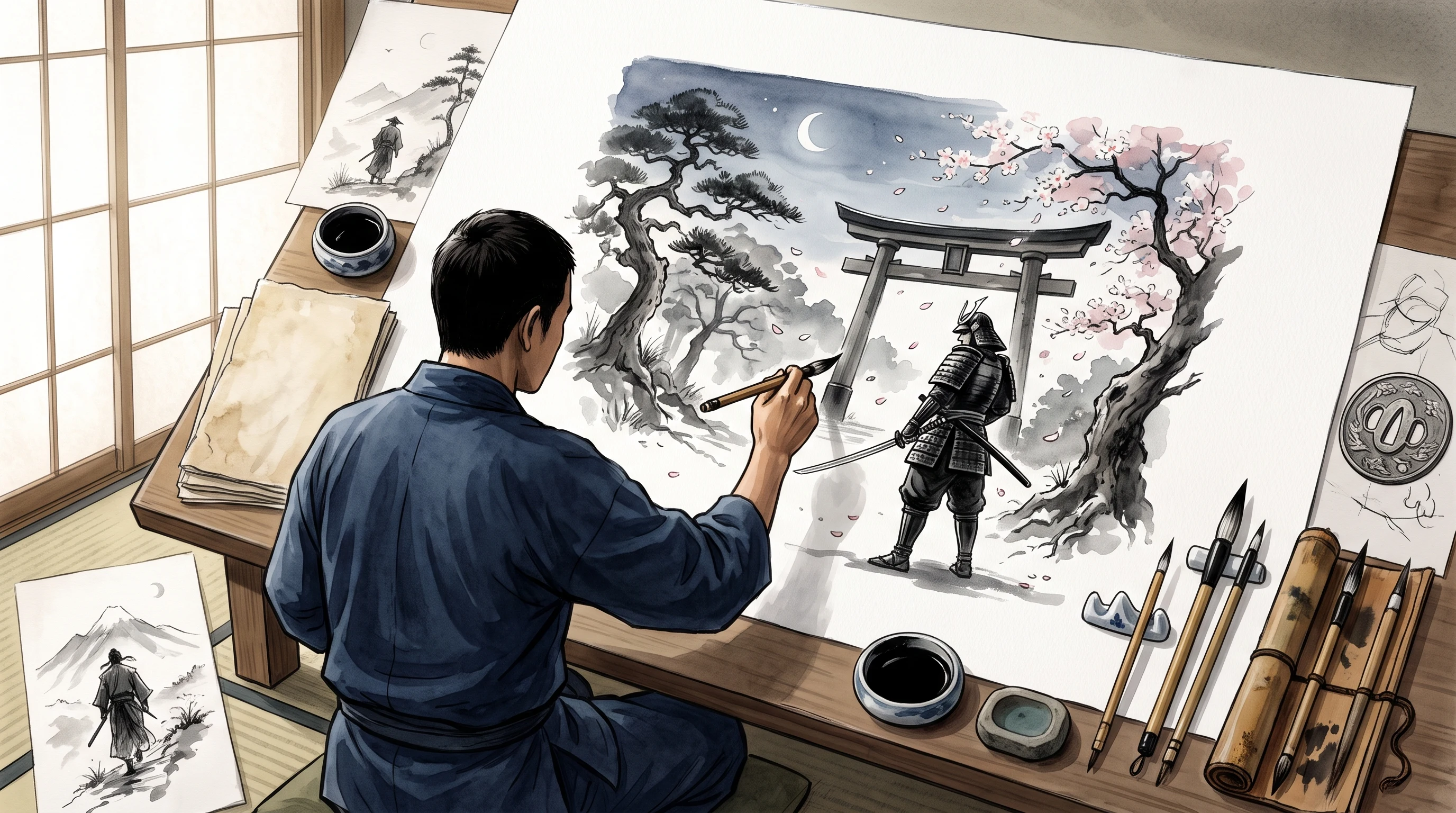
The first leans on Japanese ink painting: a lot of off-white, a single design, one deliberate brush stroke, perhaps one red accent. Here the effect comes from empty space. A katana silhouette, a tilted headpiece, a hinted suit of armor, nothing more is needed. The second family quotes the classic woodblock print: muted tones such as indigo, red-brown and cream, clear outlines, slightly stylized figures. That reads as historical and cinematic and takes more narrative in the picture. The third is the contemporary, poster-like reading with high contrast, hard silhouettes and little filigree, the direction that suits full-surface prints and strong streetwear.
What matters is that you do not mix these families. Combining a delicate ink composition with garish neon outlines takes the credibility from both approaches. Decide, and the design gains seriousness at once.
Concrete design ideas for your samurai shirt
These approaches are narrowed down enough to work directly in the design generator:
- Reduced katana: a single stylized blade, centered, black on off-white or white on black. Maximally wearable, everyday-ready, needing no explanation.
- Cherry blossom warrior: the silhouette of a fighter under falling blossoms, in calm pastel tones and a deep navy blue. Melancholic and poetic instead of martial.
- Oni mask: the demonic red mask as the graphic center, black and red and high in contrast. A loud picture idea that suits high-contrast streetwear outfits.
- A single character: a large kanji such as 武 (Bu, "warrior") or 道 (Dō, "way") in strong reduction. Describe the meaning you want precisely while creating, so the right character appears.
- Ronin scene: a masterless warrior with a cloak on a mountain ridge in the evening light. Warm, narrative, cinematic, an idea that needs surface.
- Armor detail: the close-up of a lamellar armor, almost museum-like in its accuracy. Speaks to everyone who values historical authenticity.
- Bushidō typography: a reduced composition around the virtues of the warrior code, in Japanese or in English. Grown-up and philosophical, not kitschy.
- Duel in front of bamboo: two silhouettes in the moment before the strike, static and tense, in front of a bamboo grove. Classic sword film style.
Which shirt type suits which design
The choice of the carrier material has a say in whether a design works out. A reduced cotton shirt is the natural home for wearable everyday designs: a single blade, a character, a plain silhouette. Here the chest print counts as a calm accent. The premium version in heavier cotton feels more valuable and fits when the shirt should radiate a certain seriousness or convince as a gift.
As soon as a design becomes a whole scene, landscape, warrior, a rain of cherry blossoms, it needs surface. The designer shirt with all-over print carries the picture at the front, at the back and on both sleeves, and is therefore the right choice for epic, image-strong compositions that would only appear shrunken on a pure chest print. Which version suits your budget is laid out clearly on the pricing page.
Color palette: why less is almost always more
Samurai designs lose their effect quickly when the palette gets too colorful. Two to three main tones plus one accent are enough in most cases. The combination of black, white and red is not by chance the archetype of this aesthetic: black gives weight, white creates air, and the red sets the one point that guides the eye, a lipstick stroke on a mask, the edge of a blade, a single character.
If you work with muted historical tones, keep the contrast deliberately low and go for a warm basic mood. If you want to be poster-like, you may push the contrast up, but should then do without fine lines, because they get lost in a hard print. In all cases: the color follows the composition, not the other way round. First decide what the eye should see first, and give the strongest red to exactly that spot.
Common mistakes in samurai designs
Three pitfalls come up especially often. The first mistake is mixing up history: people who say "samurai" often mean three different eras at once. If you have a particular period in mind, the Edo period for example, describe it that way, otherwise you end up with a muddled mix of armor styles that anyone who knows the subject spots right away.
The second mistake concerns characters whose meaning is unclear. A kanji is not decoration, it is language. As you create your design, describe the meaning you are after, "the character for honor", "the character for courage", so the right symbol appears and not an arbitrary one that puzzles people who can read it.
The third mistake is overloading: blade plus mask plus armor plus blossoms plus lettering adds up to noise. Cut it back to one main element and at most two supporting ones. A fourth, quieter point is cultural attitude. The samurai tradition is living heritage, and disrespectful or slapstick portrayals land badly with informed wearers. A design that respects the seriousness of this culture almost always turns out more grown up.
Meaning and background: why this theme carries
The appeal of a samurai design rarely lies in the sword alone, but in the value system behind it. Bushidō, the "way of the warrior", pairs courage with restraint, strength with courtesy. Exactly that tension is what makes the theme wearable: it speaks of discipline, not of violence. Once you understand that, you design differently, calmer, more composed, with more trust in a single gesture.
The recurring symbols carry weight too. The cherry blossom stands for the transience of life, because it falls at the height of its beauty. The masterless ronin embodies independence and an open road. The oni mask moves between protection and threat. When you pick one of these signs, you carry its history with you, and you can put that meaning into words as you create, so the design does not just look decorative but means something.
Recommendations by occasion and goal
Depending on the occasion, a different direction fits best. The following scenarios cover the most common cases without overlapping:
- An everyday statement: a pared-back cotton shirt with a single blade or character. Easy to combine, wearable with any outfit.
- A gift for people interested in Japan: a historically minded ronin or armor scene with a woodblock feel on the higher-grade premium cotton. Looks considered and respectful.
- A con outfit or a loud appearance: a full-surface designer shirt with an epic battle scene or an oni mask that is allowed to stand out in the room.
- A gift for the dojo world: a restrained cotton shirt with a character or an accurate piece of armor detail, culturally sensitive and meant as a sign of respect.
- A personal, quiet present: a cherry blossom composition in pastel on premium cotton. Poetic and unobtrusive instead of kitschy.
For a group, a shared travel or event outfit for instance, several variants of the same warrior design can be made with slight shifts in silhouette and color accent, so the shirts belong together without being identical.
Care, so fine lines stay sharp
Designs with thin lines and soft transitions benefit from a little care in the wash. For the cotton shirt: wash at 30 degrees inside out, without fabric softener and without bleach, then air dry. If you iron, only inside out and never directly on the print.
On the designer shirt with all-over print the color moves into the fiber, which is why the print stays flat and usually needs no ironing. Here too: 30 degrees inside out, no fabric softener, no tumble dryer. With this routine the fine detail of your samurai design stays clear for a long time. You will find more notes in the FAQ.
In the end a single question decides how your shirt works: which one idea should it carry? Once that answer is clear, everything else, color, material, composition, falls into place almost by itself. Start with your direction in the design generator, look at how other designs are built in the gallery, and check the right variant on the pricing page.
FAQ
How many elements should a samurai design contain?
Ideally one main element and at most two supporting details. A single blade, a mask or a character at the center works far more strongly than a combination of katana, armor, blossoms and lettering, which makes the image restless.
What should I watch out for with Japanese characters?
A kanji is language, not pure decoration. As you create your design, describe the meaning you want precisely, the character for courage or for path for example, so the right symbol appears and not an arbitrary shape that looks wrong to anyone who reads it.
Which shirt type suits an elaborate samurai scene?
Large compositions with landscape, warrior and cherry blossoms need the designer shirt with all-over print, because the design finds room on the front, on the back and on the sleeves. Pared-back single designs come across better on a cotton shirt.
How does a samurai design with fine lines stay beautiful for a long time?
Wash the shirt at 30 degrees inside out, skip fabric softener and bleach, and let it air dry. On the designer shirt the print sits in the fiber and stays flat; on the cotton shirt you iron only on the reverse if needed.