Viking shirt: Norse warrior designs with attitude
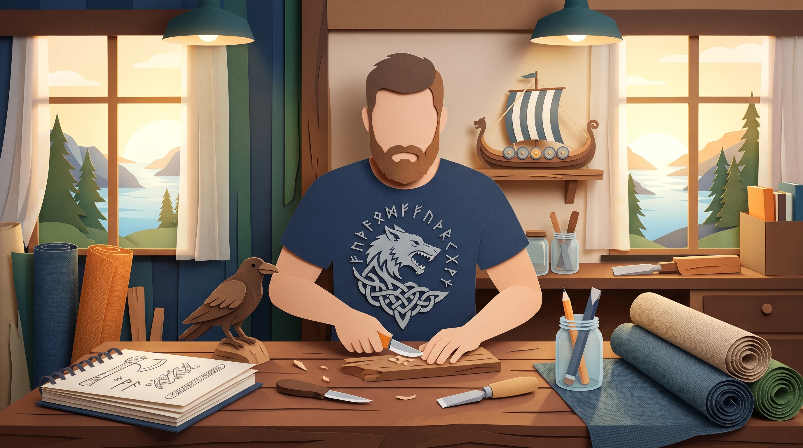
Viking shirts work best with a clear direction: symbol, power animal, scene or ornament. Here is how to build Norse designs that are wearable and timeless.
Vikings are popular as a subject and for exactly that reason hard to do well: on many shirts runes, hammer, ship, wolf and flames pile up all at once, until what is left in the end is a generic fantasy mishmash. A convincing Viking shirt is built the other way around. It starts with a decision: which Norse mood should the design actually carry? Answer that question early and you get an image with attitude instead of a collection of signs.
Four visual directions for Norse designs
Norse designs can be thought of in roughly four directions, and each one creates its own effect. The symbolic direction relies on a single sign that stands on its own. The animal direction uses raven, wolf or bear as a power animal and lives on the character in the animal's gaze. The narrative direction shows a scene, a longship, a coastline, a departure, and needs room for atmosphere. The ornamental direction works with interwoven knotwork and stays decorative rather than bold.
Which direction fits depends on how loudly the shirt should speak. A symbol works as a discreet sign of recognition, a narrative scene as a large image you show on purpose. The only important thing is to settle on one direction instead of pressing all four into a single design.
Concrete design ideas
Once the direction is set, concrete picture ideas help you start. In our experience these work well, because they have a clear shape:
- A pair of ravens in a graphic, almost heraldic arrangement, symmetrical and calm.
- A longship silhouette against morning mist, where the mood plays the leading role.
- A wolf's head in profile, strong and linear, without sprawling detail.
- Geometric knotwork as a continuous band, along the hem or across the shoulder for example.
- A single sign, placed small above the chest, that reveals its meaning up close.
This list is deliberately a collection of images, not a study of symbols. What the signs mean is a subject of its own, and exactly that is what makes the difference between decoration and statement.
Symbols and their meaning
Norse signs carry stories, and a design gains when you know the story behind the sign. In the old tradition the hammer Mjölnir stands for protection and strength. The Vegvísir is regarded as a wayfinder meant to lead you through rough weather. The ravens Hugin and Munin embody thought and memory, the world tree Yggdrasil connects the nine worlds of Norse mythology with each other, and the wolf stands for untamed power.
The practical value of these meanings lies in the choice. If you pick a sign for what it says, you wear something personal instead of an arbitrary ornament, and you quickly notice that one well understood symbol tells more than a row of signs whose meanings overlap each other.
Color worlds that suit the theme
The choice of color helps decide whether a design feels archaic or arbitrary. Norse designs take restraint well. Deep blues and grays create cold and distance, the kind you associate with the North Sea and long winters. Black and white with a single metallic accent comes across sober and warlike. Muted earth and bronze tones make a sign look venerable, almost as if struck into stone or metal.
Garish colors, by contrast, take the seriousness out of the symbolism. Two or three coordinated tones are usually enough. The relationship to the shirt color matters as well: a light design on dark fabric works differently from a dark sign on a light ground, and that belongs in the planning before the image is made.
Choosing the right shirt type
The visual direction suggests which shirt type makes sense. A pared-back symbol or a linear animal design comes into its own on a classic cotton shirt and suits everyday wear, where you reach for it often. Higher-grade fabrics fit when the shirt is meant as a gift and should feel more premium.
Large, narrative scenes, a ship running across front and back, or a continuous landscape design call for a shirt type that allows printing across the whole surface. It pays to think beforehand about whether the design should be a quiet hint or a deliberate statement, because both the size and the placement follow from that.
Common mistakes with Viking shirts
A few stumbling blocks come up again and again:
- The symbol collection: as many signs as possible at once, in the hope that more automatically looks more impressive. Usually the result is visual noise instead of strength.
- Meaningless rows of runes, strung together as decoration, that add up to nothing on closer inspection.
- A palette that is too colorful and undermines the serious, archaic character of the theme.
- A design without a clear focal point, where the eye does not know where to look first.
Most of these mistakes dissolve once you give the image one center and subordinate everything else to it.
License-free and timeless instead of a borrowed look
A lot of what is sold as Viking fashion leans closely on popular series, bands or ready-made templates. At first glance that looks strong, but it ties the shirt to a short-lived trend and to someone else's imagery. An independent Nordic design is free of that. It picks up the aesthetic and the symbolism without copying a particular character or brand, and stays wearable for years.
Precisely because Nordic imagery lives on clear, archaic forms, an independent design lasts longer than a fan design tied to a passing fashion wave that nobody can place a few years later. If you lay the design out freely and individually, you also decide every detail yourself, from the choice of symbol to the color.
Nordic designs for every style
Viking designs are often seen as a men's theme, yet the Nordic aesthetic carries much further. Fine runes, elegant knotwork or a pared-back raven design work regardless of gender and fit into many wardrobes. The execution makes the difference: a delicate, linear sign tells a different story than a massive, high-contrast warrior's head.
As a gift, a design like this suits anyone who appreciates history, mythology or the raw atmosphere of the north. If you are unsure, start with a pared-back sign in muted colors: that is the most versatile option and can always be made bolder later.
What you end up with is a Nordic design that fits a person instead of following a cliché. If you have an idea, you can describe it in your own words in the design generator and compare several variants. For a first impression, take a look at the gallery, and you will find the differences between the shirt types on the prices page.
FAQ
Which Nordic symbol is a good starting point?
A single, clear sign is the most versatile. The Vegvísir as a wayfinder or a raven design are popular, because both keep a recognizable shape even when pared back. What matters is choosing a symbol whose meaning fits you, instead of combining several signs.
Are Viking designs only for men?
No. The Nordic aesthetic ranges from delicate, linear runes to massive warrior heads, and works across every gender. Fine knotwork or a subtle symbol in muted colors fits into very different wardrobes.
Which colors suit Nordic designs?
Restrained palettes carry the theme best. Deep blues and grays stand for distance and cold, black and white with a metallic accent looks sober, muted earth and bronze tones make a sign feel venerable. Two or three coordinated tones are usually enough.
What should I watch for when it comes to the size of the design?
That depends on the effect you want. A small symbol over the chest works as a subtle marker, while a narrative scene needs surface and a shirt type that allows large-area printing. Before you draft, decide whether the design should be quiet or deliberately eye-catching.