Crusader shirt: knight designs between history and dark fantasy
Looking for a crusader T-shirt? Heraldry, portrait or dark fantasy as your own design instead of mass-produced goods: describe it, look at it, order from €36.99. With examples and clear design rules.
Crusaders are among the most searched knight designs of all, and among the most often botched. On many shirts, armor, sword, burning castle, banner and gothic type pile up until nothing is left of the knight but noise. A strong crusader shirt comes about the other way round: it starts with a single decision. Which facet of the knight should the design carry, the heraldic order, the character behind the visor, the scene of a quest or the dark legend?
Four visual directions for knight designs
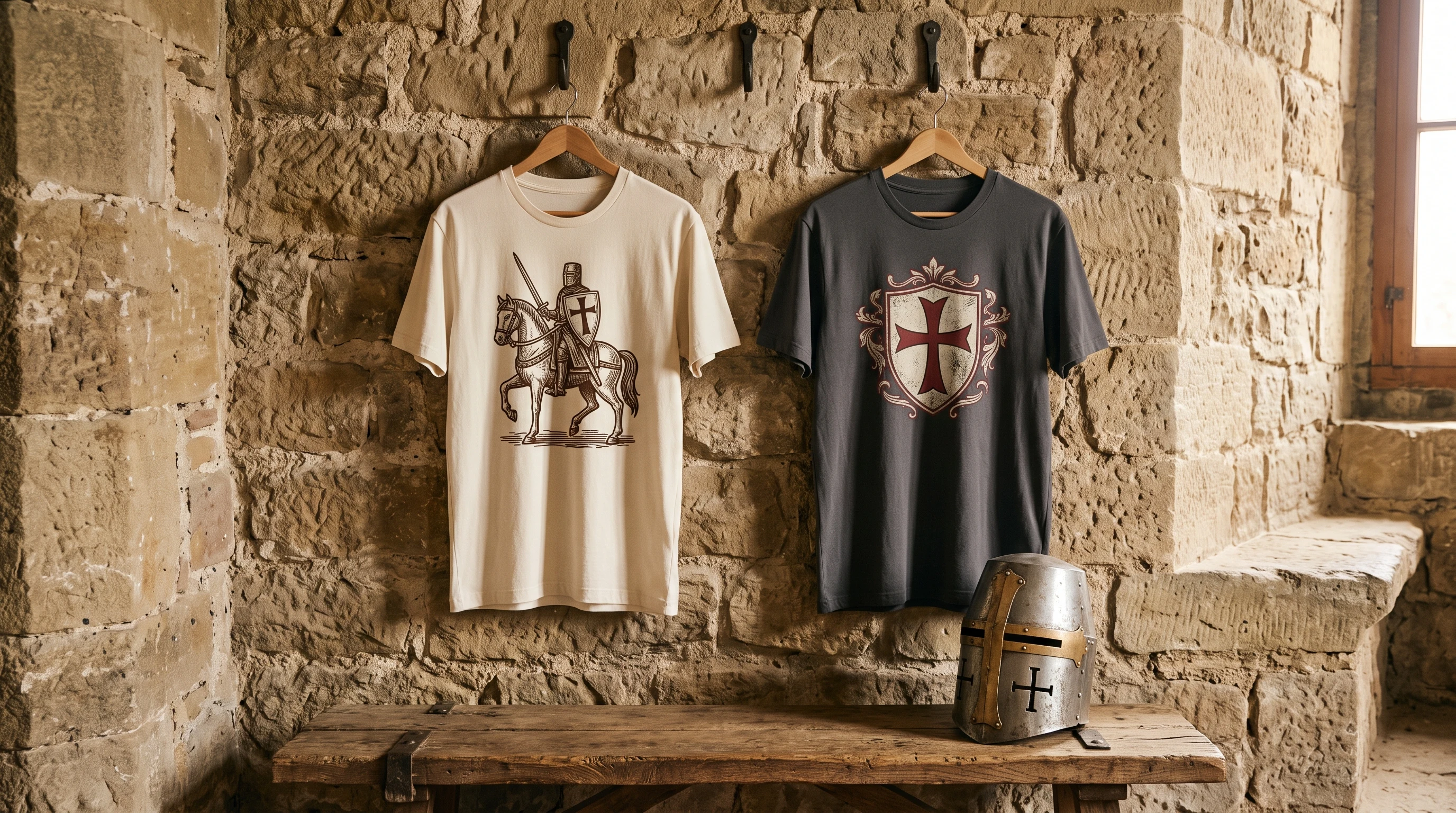
The heraldic direction works like a coat of arms: a cross, a shield, a clear form with an almost logo-like effect. It is the most timeless variant and works small on the chest too. The portrait direction shows helmet and armor head-on, and all its tension lies in the gaze through the visor slit, in what you precisely do not see. The narrative direction builds a scene: a rider before a castle, a departure into the mountains, a quest under the moon. It needs surface and lives on atmosphere. And the dark fantasy direction deliberately breaks away from the history lesson: crown, flames, rough textures, less document, more legend.
Which direction fits depends on how loudly the shirt should speak. Heraldry is a subtle marker, a burning crown is a declaration. Both are legitimate, only mixed do they turn to mush.
Style worlds: woodcut, vintage comic, dark fantasy
For historically flavored designs, the woodcut or engraving look is the strongest choice: coarse hatching, limited tones, deliberately imperfect edges. It quotes the imagery of old prints and therefore feels credible rather than costumed. A second, often underrated track is the vintage comic style, bold outlines, flat colors, a hint of space pulp. It takes the heaviness out of the theme and turns the knight into a figure with a wink. The third track is dark fantasy: deep black, glowing accents, textures like charred wood. Here mood counts more than historical accuracy.
In the crusader gallery you can see all three directions on real, individually generated designs, from the woodcut rider to the flaming crown. Each one was drafted exactly once.
Color world: less is more medieval
Knight designs take surprisingly little color. Monochrome or sepia on a light ground carries the woodcut look. Black with a single red or gold accent carries dark fantasy. Muted earth tones, umber, bone white, iron gray, carry the historical. As soon as a design mixes four or five rich colors, it tips into the arbitrary. A good rule of thumb: one basic mood, at most one accent.
Placement: emblem or surface
Heraldic designs work best small, as a chest emblem, like a badge. Portraits and scenes, by contrast, need the full front, otherwise they lose detail and impact. If you prefer it subtler, turn the principle around: a small cross emblem on the front, the big scene on the back. That keeps the shirt calm in everyday life and reveals its story only on second look.
The most common mistakes
The first mistake is overload: three designs stacked on top of each other do not make an epic, they make noise. The second is historical arbitrariness: a Viking axe, a Templar cross and a samurai sword on one shirt cancel each other out. If you like Nordic designs, you are better off with your own Viking design; if you are after the Far Eastern warrior aesthetic, with a samurai design. The third mistake is clumsy slogans in blackletter type, which turn a picture into a poster. If text, then short, small and part of the composition.
From thought to one-off
An off-the-rack crusader shirt shows the design a thousand other people wear too. The other way: you describe your idea, direction, style, mood, and out of it comes a design that was drafted exactly once. Whether a quiet woodcut rider or a glowing crown: a clear idea becomes a one-off instead of mass-produced goods. How that works step by step is shown on the design your own knight T-shirt page, from the first description to the finished shirt.
FAQ
Which style suits a historically flavored crusader shirt?
The woodcut or engraving look is the most credible choice: coarse hatching, few tones, deliberately rough edges. It quotes the imagery of old prints instead of claiming a costume. Monochrome or sepia strengthens the effect.
Is a crusader design safe to wear today?
As a historical, aesthetic design yes, and the execution is what decides it. If you leave out slogans, aggressive lines and blunt combinations and go for heraldry, a scene or a dark fantasy mood instead, you wear a world of imagery, not a message.
Small emblem or large design, which works better?
Heraldic designs work most strongly small on the chest, like a badge. Portraits and scenes need the full front or the back. A proven combination: a subtle cross emblem on the front, the big composition on the back.