Steampunk shirt: machine romance instead of costume rental
Good steampunk shirts show a love of mechanics instead of costume clichés. Four visual directions, the brass and sepia palette and typical mistakes, that is how the genre becomes wearable.
Steampunk is one of the most rewarding visual worlds for a shirt, and one of the most misunderstood. Many designs pile up top hats, goggles, gears and pipes until the result looks like a costume shop. Yet good steampunk design lives on something else: a love of mechanics. A convincing steampunk shirt starts with the question of which piece of this invented world of machines it should show.
Four visual directions for steampunk designs
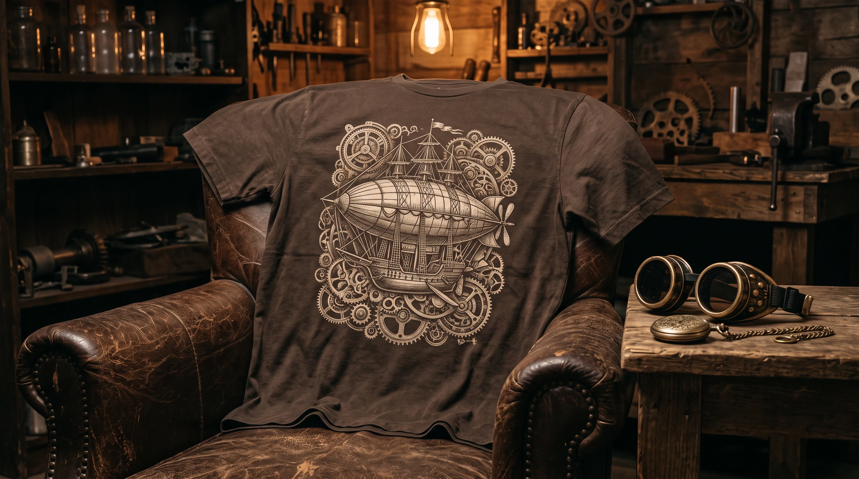
The mechanical direction is the heart of the genre: gears, clockwork, pistons, precision as ornament. It works as a detailed exploded drawing just as well as a pared back emblem. The vehicle direction shows the dream machines of the genre: a zeppelin above the clouds, an airship between constellations, an impossible locomotive. It needs space and tells the most. The figurative direction puts inventors, aviators or mechanical beings at the center, and here character counts, not equipment. And the emblematic direction distills the genre into a single sign: a winged gear, a heart made of brass, a compass rose.
If you want to see how differently this can land, the design worlds Gears and Clockwork hold real examples, and every design there was created just once.
The color world: brass, copper, sepia
Steampunk comes with a built in palette, and that is its greatest advantage. Brass and copper tones, warm sepia, plus deep charcoal or midnight blue as the ground, nothing more is needed. This limit is not a sacrifice but a style: it holds even complex machine designs together. If you want an accent, take a bright turquoise or teal, the patina color of oxidized copper, at home in the genre and electrifying on dark fabric.
The style decision: engraving, blueprint or painting
The engraving look, fine hatching as if taken from a Victorian patent book, is the most classic treatment and suits mechanical and emblematic designs. The blueprint look turns the principle around: light lines on deep blue, as if the construction drawing itself were lying on the shirt. The painterly treatment, finally, gives vehicle scenes atmosphere, and a zeppelin in evening light carries more mood than any hatching, however detailed.
The most common mistakes
The first mistake is the costume cliché: a top hat plus goggles plus a moustache does not make a steampunk design, it makes fancy dress. The second is overcrowding: once every free corner gets another gear, the mechanics lose exactly the precision that makes them interesting. The third mistake is the wrong palette: garish rainbow colors break the world of the genre. Anyone who likes it colorful is better served by other visual worlds; anyone who wants machine romance stays with brass and sepia.
Placement and effect
Emblems, the winged gear, the brass heart, work strongest small on the chest. Machine details and vehicle scenes need the full front or the back. An elegant combination for the understated: a small gear emblem on the front, the large construction on the back. That keeps the shirt calm in everyday life and shows its world only on the second look.
From genre to a single piece
Off the rack steampunk shows the same set pieces every time. The other route: you describe your machine, the clockwork heart, the zeppelin over the city, the blueprint of an impossible apparatus, and out of that comes a design that was created exactly once. An invented world deserves a shirt made specifically for it.
FAQ
Which colors suit a steampunk shirt?
The genre palette: brass and copper tones, warm sepia, plus charcoal or midnight blue as the ground. Turquoise or teal works as an accent, the patina color of oxidized copper. Garish rainbow colors break the visual world.
What separates a good steampunk design from the cliché?
The cliché piles up props: top hat, goggles, moustache. A good design picks ONE piece of the machine world, a clockwork, a zeppelin, a blueprint, and executes it precisely. A love of mechanics beats fancy dress.
Detailed or pared back, what works better on the shirt?
Both, in different places: an emblematic gear sign works strongest small on the chest, while detailed machines and vehicle scenes need the full front or the back. A proven combination: a discreet emblem on the front, the large construction on the back.