JDM shirt design ideas: Japanese car culture with a clear line
A JDM shirt works best when style, colors and design fit together. These ideas bring Japanese car culture onto a shirt, calmly and individually.
A good JDM shirt does not come from some random sports car graphic, it comes from an attitude. People who like Japanese car culture rarely want mass-produced goods off the rack, they want a design with a clear direction: technical and reduced, nocturnal and atmospheric, or deliberately nostalgic. This scene has its own visual language, grown out of the Japanese Domestic Market and its imported cars, and that is exactly where the appeal of your own design lies. Instead of wearing a ready-made logo, you build an aesthetic that fits your corner of the scene.
Which JDM direction suits you
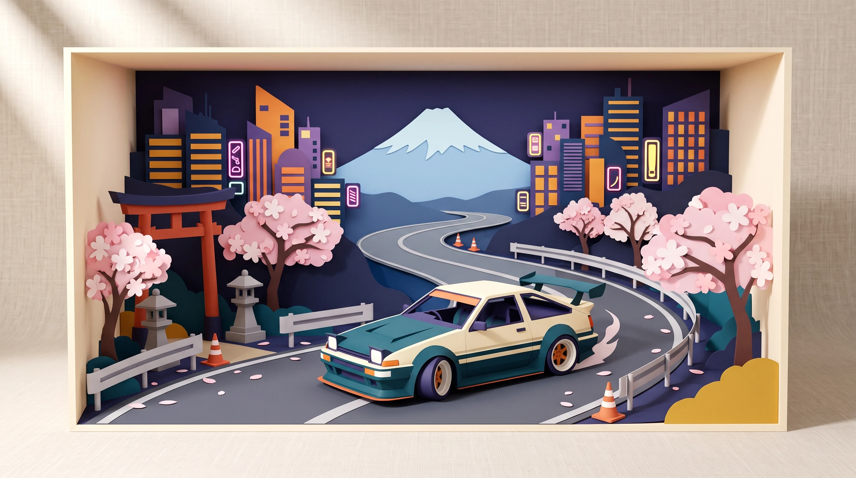
Before it gets to the design, the question of mood is worth asking. JDM is not one uniform style, it is a spectrum. At one end sit calm, technical depictions: a wheel, a gauge, a silhouette. At the other end is the loud, high-contrast tuner look of the late nineties. In between lie mountain passes at night, urban car meets and the raw underground aesthetic of Japanese street racing.
The more clearly you settle on one direction, the better the result turns out. A design that wants to be everything at once quickly looks overloaded. Three questions help narrow it down:
- Is your scene more reduced and technical, or loud and graphic?
- Should the design work in daylight, or capture the night-time atmosphere of a street?
- Is it about one specific car, or about the culture around it?
Designs that really hold up
JDM often lives on the fragment rather than on the whole car. A cut-out sports car quickly looks like a catalog picture; a detail, on the other hand, tells a story and leaves the completion to the viewer. These have proven themselves:
- Front end in close-up: a classic pop-up headlight or a round main light seen up close.
- Rear view: tail lights, twin exhaust, diffuser, the angle you see last on a mountain pass.
- Wheel as a graphic: a detailed, multi-spoke wheel as the central, almost technical design.
- Drift trail: nothing but the smoke and tire marks of a car going sideways, almost abstract.
- Skyline silhouette: a big city backdrop with a low sports car in the foreground.
- Gas station at night: a lit forecourt, a lowered car in front of it, a lot of black around it.
- Japanese typography: characters connected to the car scene, monochrome or in a red rally look.
- View from the cockpit: steering wheel, gauges, shift knob, detailed and nostalgic.
These details work because they are instantly readable for people in the know and stay a stylish graphic for everyone else. That is the strength of a well-chosen JDM design: it speaks on several levels.
Colors and atmosphere
The choice of color decides the mood more strongly than the design itself. Black is the safe basis and fits almost every direction. On it, neon accents in cyan, violet or green glow like the scattered light of a street at night, ideal for mountain pass and gas station scenes.
For the nostalgic tuner look of the nineties, a bolder play of red and white with hard contrast works. If you prefer things urban and reduced, combine asphalt gray with a single strong accent. Muted tones such as cream and dark blue in turn carry an older, almost poster-like patina and suit designs from the seventies and eighties. Restraint matters: a clear line with few colors almost always looks more valuable than a firework of effects.
Choosing the right shirt type
At Isakum every design is made on two different carriers, and the choice affects how a design comes across. The cotton shirt places the graphic classically on the chest or the back. It is the more understated version, comfortable in everyday life and ideal when a single clear image should take center stage, a piece of typography or a wheel graphic for example.
The all-over print shirt, by contrast, prints the entire surface on all four sides. It carries larger scenes: a continuous mountain pass landscape, a skyline that wraps around the body, or a drift trail running across the side. If you want a complete image instead of a single chest design, this is the right choice. You will find an overview of both versions on the pricing page.
Common mistakes in JDM design
Three pitfalls keep coming up. First, overloading: too many elements, too many colors, too much text. JDM aesthetics live on reduction, not on completeness. Second, the arbitrary vehicle rendering without context, a cut-out car on an empty background looks interchangeable. A street, a light, a time of day are what give the design its atmosphere in the first place.
Third, the wrong color basis. Red as the main color, for instance, only works with a clear retro racing reference; in most cases black is the more discreet and at the same time more effective choice. If you keep these three points in mind, you get closer to a design that does not look mass-produced.
Where the visual language comes from
JDM culture is visually shaped deeply by manga, anime, film and video games. Mountain pass races at night, the highway of a huge city after dark, the technical precision of racing simulations, these sources have delivered a whole generation of images that the scene refers back to.
For your own design you do not have to copy anyone else's template. It is enough to pick up the atmosphere: the scattered light over a mountain road, the reflection of a neon sign on wet asphalt, the view from the cockpit. References like these read as a quiet sign of recognition for insiders and stay a well-made graphic for everyone else. That double reading is exactly what makes a design last, instead of tying it to a short-lived trend.
Occasions and gift ideas
An individual JDM design sits close to a person and therefore works well as a gift. It fits the registration of a new car, the end of a long build project, or simply the birthday of a car-obsessed friend. As a keepsake from a trip to Japan, a skyline silhouette of the city you visited also carries more meaning than any random souvenir.
In everyday life a shirt like this blends in quietly and at the same time becomes a soft statement to others in the know, at the gas pump, on a visit to the workshop, at a car meet. For a whole crew, a shared theme can be worked out in individual versions: uniform enough for a joint appearance, personal enough that no one wears the same graphic. If you are still undecided, the gallery has finished designs as a starting point, each of them designed once and only once.
Care in everyday life
JDM shirts get worn a lot, so care is worth a look. Wash at 30 degrees inside out on a gentle cycle, without fabric softener. Skip the dryer at high temperature and dry the shirt flat or hanging in the shade. The sublimation print is worked into the fiber and stays color-fast for a long time; with very dark base colors, though, strong direct sun can slightly bleach the fabric itself, which is why the shirt dries best in the shade. Stains from a day in the workshop are best pre-treated soon, before they set.
If you want to build your design from scratch yourself, simply describe the mood you are after in the design generator, reduced, nocturnal, nineties or futuristic, and compare several variants before ordering. The gallery offers first ideas, and all details on the two shirt types are on the pricing page. That way a design takes shape in peace, one that really suits your own corner of Japanese car culture.
FAQ
Which shirt type suits a JDM design better?
That depends on the design. A single clear image such as a piece of typography or a wheel comes across well on the cotton shirt, because it sits calmly on the chest or the back. Larger, continuous scenes such as a mountain pass landscape or a wraparound skyline need surface and look more complete on the all-over print shirt.
Which base color works for most JDM designs?
Black is the most discreet and most versatile choice and fits nearly every direction, especially night-time designs with neon accents. White works well for the brighter tuner look of the nineties. Red as the main color only makes sense with a clear retro racing reference, otherwise it quickly becomes too dominant.
Do I have to show a specific car for a design to read as JDM?
No. Details and atmosphere often carry more strongly than a whole car. A pop-up headlight, a drift trail, a mountain pass at night or Japanese typography are instantly readable for people in the know, without any particular model being visible. That makes the design more distinctive and less interchangeable.
How do I care for my JDM shirt properly in everyday life?
Wash it at 30 degrees inside out on a gentle cycle without fabric softener, and dry it in the shade instead of in the dryer at high temperature. The print sits in the fiber and stays color-fast for a long time; very strong direct sun can, however, slightly bleach the dark fabric itself. Stains are best pre-treated soon.