Design a classic car shirt: designs, colors and style
A classic car shirt works when design, color world and cut fit together. Here is how to bring classic car aesthetics across calmly and with quality.
A good classic car shirt lives on attitude, not on volume. Classic vehicles bring shape, a feel for materials and history with them, and exactly that calm should show up in the design. Most standard products waste this potential, because they put some old car on the fabric and hope for the recognition effect. More convincing are drafts that work deliberately with lines, patina, chrome reflections and the atmosphere of a workshop. If you get clear beforehand about what a classic car means to you, your design decisions end up calmer and longer-lasting too.
Which designs classic vehicles really carry
A successful classic car design carries one single thought through to the end instead of layering several ideas. The following directions have proven to work, because they show character without tipping into kitsch:
- Side profile of a classic roadster: long hood, short rear, wire-spoke wheels. The silhouette alone carries the shirt.
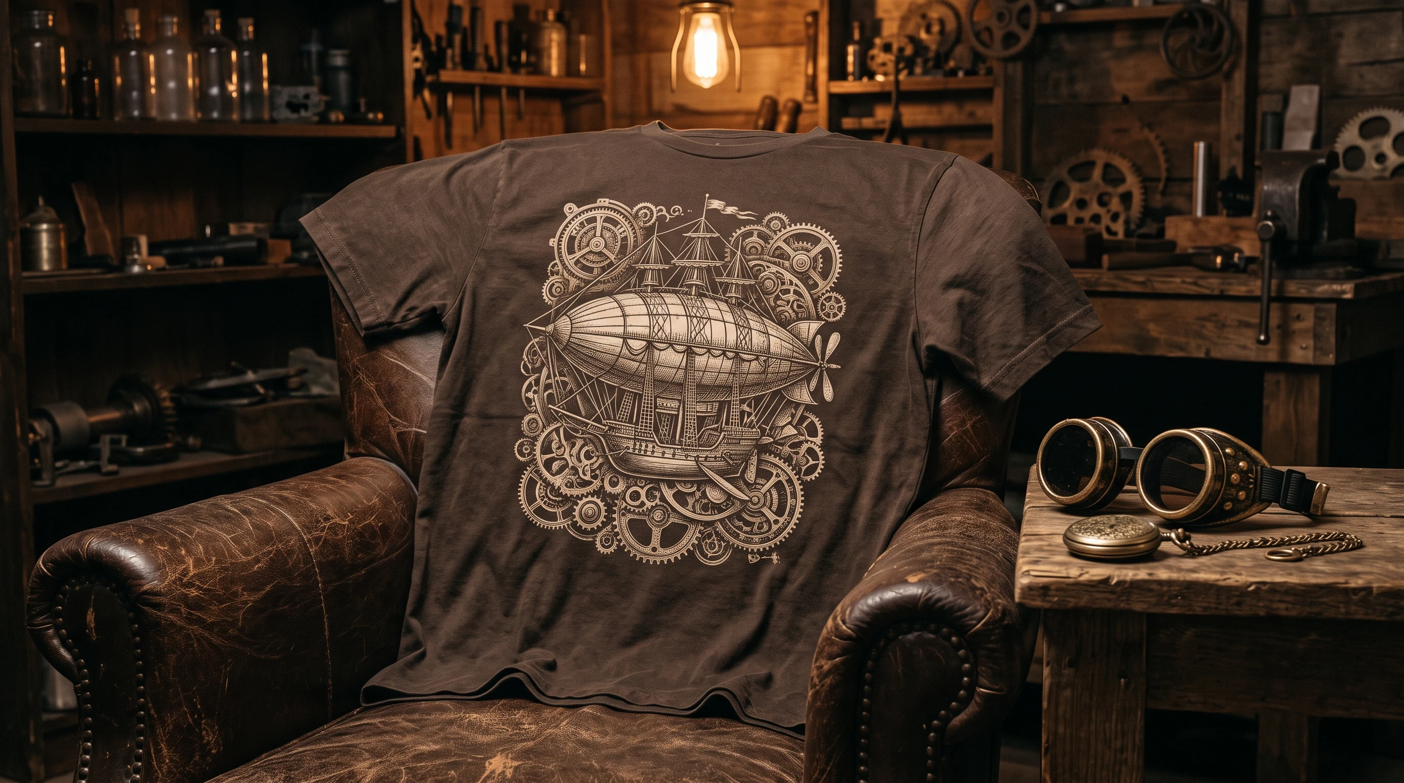
- Workshop scene: a lift, a tool wall, a half-stripped car in warm light. Here the atmosphere counts for more than the exact model.
- Chrome details in close-up: radiator grille, headlight ring or bumper bar as a pared-back graphic.
- Instrument study: wood veneer, chrome-rimmed round dials, a shift knob in a light material.
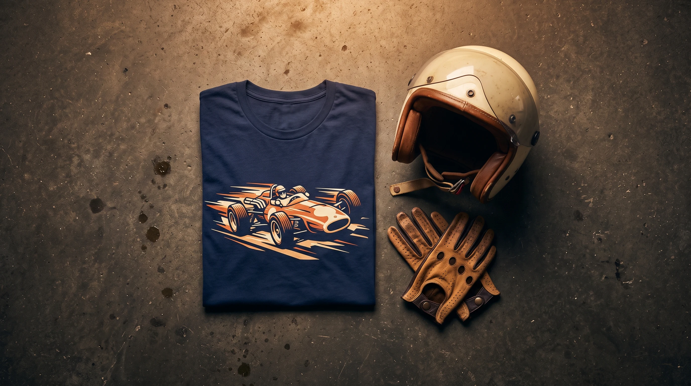
- Race poster in a historic style: stylized typography, a low-slung car, a start number in a circle.
Restraint is what matters. A single, well-drawn detail comes across as more assured over time than an overloaded overall picture.
The right color world for a vintage aesthetic
With historic vehicles, color often decides more than shape. On vintage themes, muted earth tones look calmer and more valuable than garish ones, because they pick up the patina and the material feel of the subject. Cream, dark green, burgundy, petrol, off-white and a deep blue have all proven themselves. A dark base tone with a single warm accent, a cream-colored car on a green ground for example, gives the design depth.
Loud colors and neon rarely suit this picture world, because they break the historic feel. Even a strong red comes into its own best with a clear motorsport reference, otherwise it quickly turns arbitrary. Gray is the safe middle ground when a design should look neither too warm nor too cool. What decides is inner coherence: a calm palette makes the design look grown-up, not playful.
Which shirt type suits the design
The choice of fabric depends on how much surface the design needs and where it will be worn. A classic cotton shirt with a chest or back print suits understated everyday shirts where a single detail is enough. It wears just as inconspicuously at the hardware store as on a visit to the workshop.
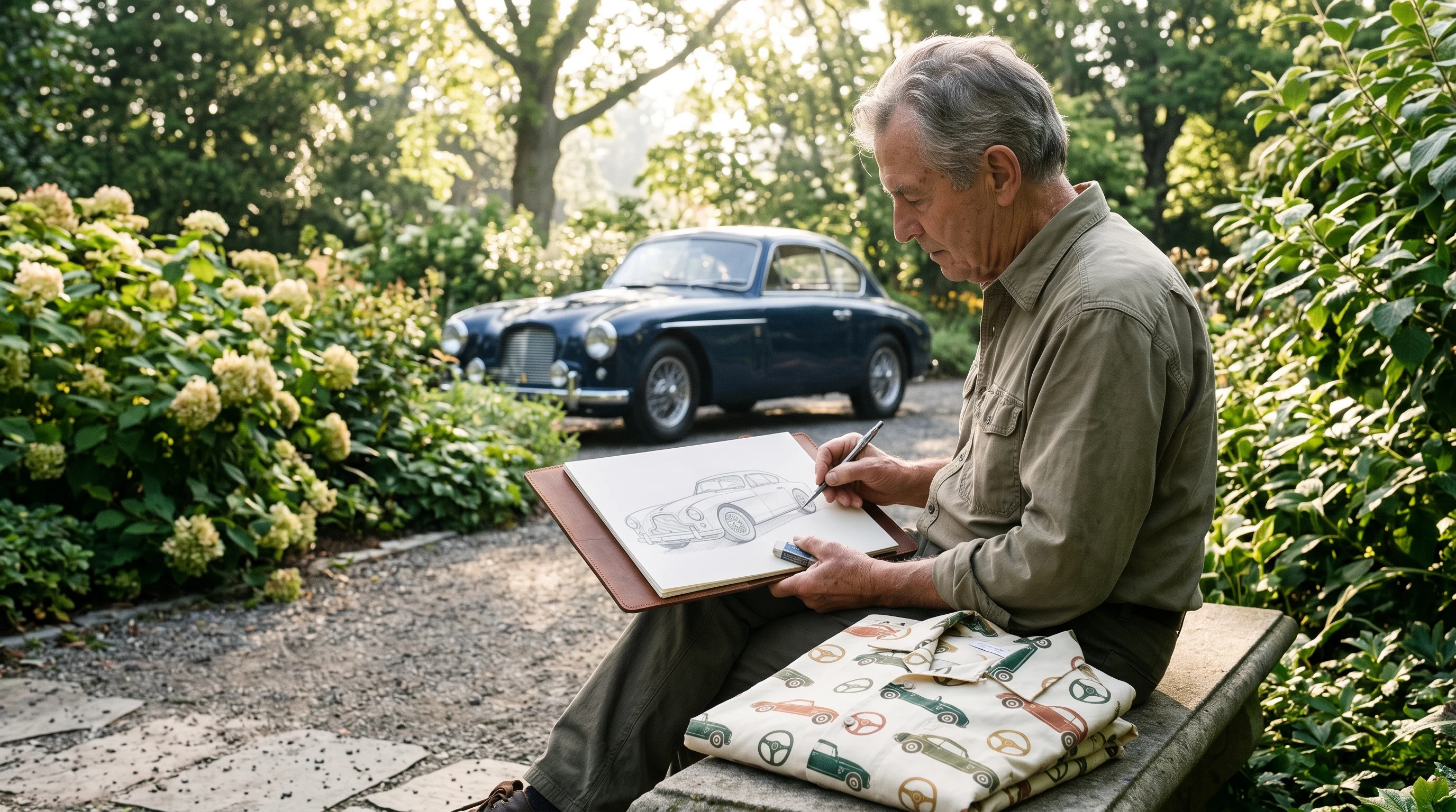
If a whole picture is meant to come into its own, a workshop scene or a race poster across the full surface for instance, the all-over print shirt is the way to go, with the design running across every side. For a gift on a special occasion the more elaborate piece is a deliberate choice; for daily use in the garage the plain cotton version is often the more honest one. The current conditions are on the pricing page, so you can weigh effort and occasion at your leisure.
The era as a design frame
Classic vehicles are often sorted by decade, and each decade has its own visual language. If you commit your design to one specific era, you get a more coherent result than from a mix of several styles.
- Pre-war years: narrow silhouettes, long hoods, chrome spokes and Art Deco influences. A restrained palette of black, dark green and wine red underlines the elegance.
- Post-war 1950s: wide radiator grilles, tail fins, plenty of chrome. Pastel accents fit here without tipping into the garish.
- The 1960s: slim and at the same time dynamic sports cars. A pared-back, graphic treatment in muted colors looks timeless.
- 1970s motorsport: wide fenders, stripes, stronger colors. The design takes more contrast here, as long as the tones stay coordinated.
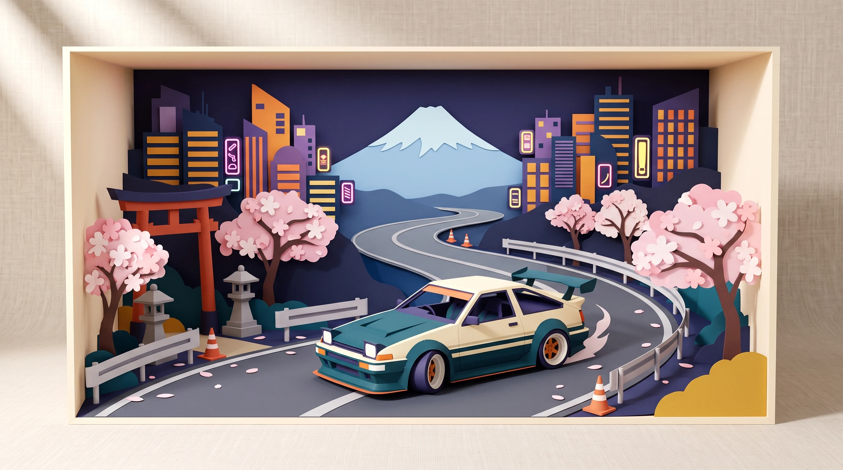
- 1980s youngtimers: angular shapes, pop-up headlights, early digital tech. Clean edges and cooler but still muted accents hold the look together.
A 1950s pastel feel on an angular youngtimer quickly falls out of balance. Clarity in the period reference keeps the picture believable, because shape, color and detail come from the same era.
Common mistakes in classic car designs
Three patterns keep showing up in drafts that do not work. Know them and you avoid them early:
- Too much at once: speedometer, steering wheel, car and lettering all at the same time do not make a design, they make a collection of material. One idea per shirt is enough.
- Mixing eras: elements from different decades cancel each other out. A clear era gives the picture calm.
- Garish colors: they take the dignity away from classic vehicles. Muted tones respect the subject.
A fourth, quieter mistake is arbitrariness: a generic car with no recognizable character. Only a concrete detail, a particular line or a recognizable mood turns a picture of a car into a design with a connection.
Care that preserves the design
A workshop shirt sees oil, grease and dust, that is part of its character. The sublimation print itself stays colorfast, because the ink goes into the fiber; oil stains in the weave should still be treated promptly so they do not set. A wash at 30 degrees, inside out and on a gentle cycle, without fabric softener, has proven itself. Stubborn stains can be pre-treated with gall soap or a little dish soap, left briefly to work, then washed. A dryer at high temperature is not a good idea, because elastic fibers can deform. Dried in the air in the shade, the shirt keeps its shape. In the wardrobe it hangs best apart from heavily soiled work clothes.
Occasion and gift: when a classic car shirt fits
As a gift, a classic vehicle design works above all because it is personally meant. It speaks to people who value technology and history: to wrenchers and collectors, to garage people and visitors of classic car meets, to the father or the partner with a car passion of their own. Instead of working through three different recommendation lists, one simple thought helps: the design should say something about the person receiving it.
A few occasions where a shirt like this feels right:
- The milestone birthday of a wrencher, ideally with a workshop scene that mirrors what they do.
- The completion of a long restoration project, for example as a clean silhouette of the finished car.
- A meet or a drive in the classic car scene, where an understated design says more than an event logo.
- Father's Day, when an elegant roadster in profile picks up the shared hobby.
Unlike brand-tied classics from official manufacturer collections or the selection on large print marketplaces, what comes out here is not a logo shirt but a design from your own imagination. That makes it less of a mass-produced item and more of a personal piece that keeps being worn after the occasion.
From idea to finished shirt
At the start there is no technology, there is a decision: which era, which mood, which single detail should be in the foreground. From that the color world follows almost by itself, along with the question of whether an understated chest print is enough or the design needs the whole surface. Only then is it worth putting several variants side by side and comparing them calmly, until style, colors and design fit together. If you like, gather impressions in the gallery first, then carry the calmest, clearest idea over into your own design.
Once the direction is set, you can build the design step by step in the design generator, the gallery holds examples that have already been made for orientation, and the conditions for the individual shirt versions are laid out clearly on the pricing page. That way a classic car shirt takes shape calmly, one that takes the subject seriously instead of just quoting it.
FAQ
Which shirt type suits a classic car design?
That depends on the design. A single detail such as a radiator grille or a roadster silhouette comes across calmly on a cotton shirt with a chest or back print. A whole scene across the full surface, a workshop or a race poster for example, benefits from the all-over print shirt, where the picture runs across every side.
Which colors suit classic vehicles best?
Muted earth tones pick up the patina and the material feel of the subject best: cream, dark green, burgundy, petrol, off-white and a deep blue. A strong red works above all with a clear motorsport reference. Garish colors or neon, on the other hand, break the historic feel.
How do I care for a printed classic car shirt properly?
Wash at 30 degrees, inside out and on a gentle cycle, without fabric softener. Pre-treat oil stains with gall soap or a little dish soap and let it work briefly. Avoid the dryer at high temperature, since elastic fibers can deform, and dry the shirt in the shade in the air instead.
Is a classic car shirt a good gift?
Yes, above all when the design says something about the person receiving it. A workshop scene for a wrencher, the silhouette of a freshly restored car or an elegant roadster for Father's Day feel more personal than a logo shirt. What counts is the recognizable link to their own car passion.