Graffiti shirt: design ideas for urban street looks
A graffiti shirt convinces when the urban signature is clear rather than chaotic. These ideas help you with tag, stencil and street art designs.
A graffiti shirt lives off a tension that is hard to hit: it should look raw and untamed and still make you want to wear it. That is exactly where many drafts fail. They stack tags, drips, characters and lettering on top of each other until urban energy turns into pure restlessness. The stronger designs come about when you settle on a direction beforehand and give the picture room to breathe. Graffiti is a visual language of its own with a history, rules and a signature, and a good shirt translates one clear thought from it instead of the whole wall. This guide is about design ideas, color handling, choosing the right shirt type and the mistakes that make a graffiti shirt look cheap.
Which street art direction suits you
Before you think about colors or lettering, it pays to ask about the basic attitude of the design. Four directions carry especially reliably:
- The reduced tag: a single, confident piece of lettering, often in hand-drawn lines. This is the most direct way to set a word or a name like a signature.
- The typographic surface: one term in bold graffiti lettering that takes up the whole chest. Here the shape of the letters counts more than any extra ornament.
- The stencil style: sharp edges, often a single figure or silhouette, in the spirit of political wall art. Looks grown up and controlled.
- The urban collage: several layers of tags, stickers and traces that echo a wall or a train car. Demanding, because it needs a lot of area and a good eye for composition.
The earlier you commit, the easier every further decision becomes. One direction gives the design a signature; four directions at once add up to noise.
Ten design ideas for a strong graffiti shirt
- Wild style lettering: a single, dominant tag in dimensional 3D letters. Works on plain cotton and reads like a deliberate statement.
- Stencil silhouette: a figure as a clean stencil on a concrete gray ground with a spare palette. Restrained, grown up, easy to combine.
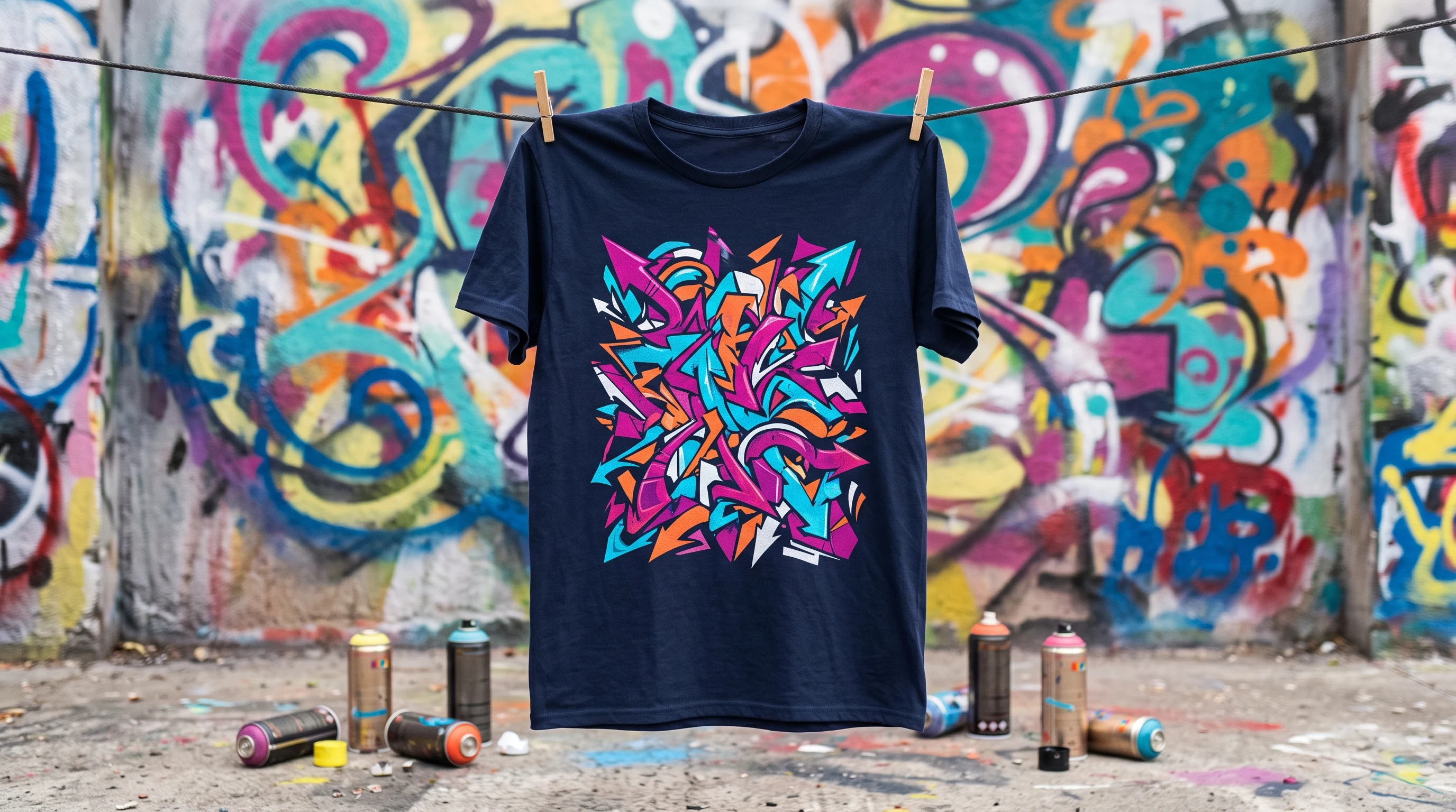
- Neon throw-up: a classic throw-up in pink and cyan with a black outline. Lives off area, so more something for large-area print.
- Urban collage: several layers of stickers, tags and wear marks in a mixed media style. Complex, and therefore convincing only across the full print area.
- Graffiti character: an angular character, a clown or a grimace for example, as the graphic center of the design.
- Pure word: a single term such as "STREETS", "CITY" or "NOISE" in spray lettering. Boiled down to the essentials and especially wearable because of it.
- Abstract drips: loose spray traces with a tightly held color palette. Reads more as modern art than as wall graffiti.
- Splatter with an anchor: a firmly outlined figure or a tag, surrounded by deliberately placed splatters. Dynamic without tipping into chaos.
- Retro subway: a composition in the spirit of early subway art, with track lines and eighties lettering. Nostalgic and culturally loaded.
- Mini tag: a single small piece of lettering on the chest, the rest of the shirt stays empty. The most restrained variant and effective precisely because of it.
Color handling: fewer tones, more signature
Graffiti designs rarely fail on the idea and almost always on the color. A simple rule of thumb helps: at most three main tones plus one accent. As soon as a fourth or fifth color joins in, the picture loses its line. Three color worlds have proven themselves:
- Black and white with gray gradations: one splatter line, one tag, one stencil. Kept strict, it fits everyday life and understated streetwear.
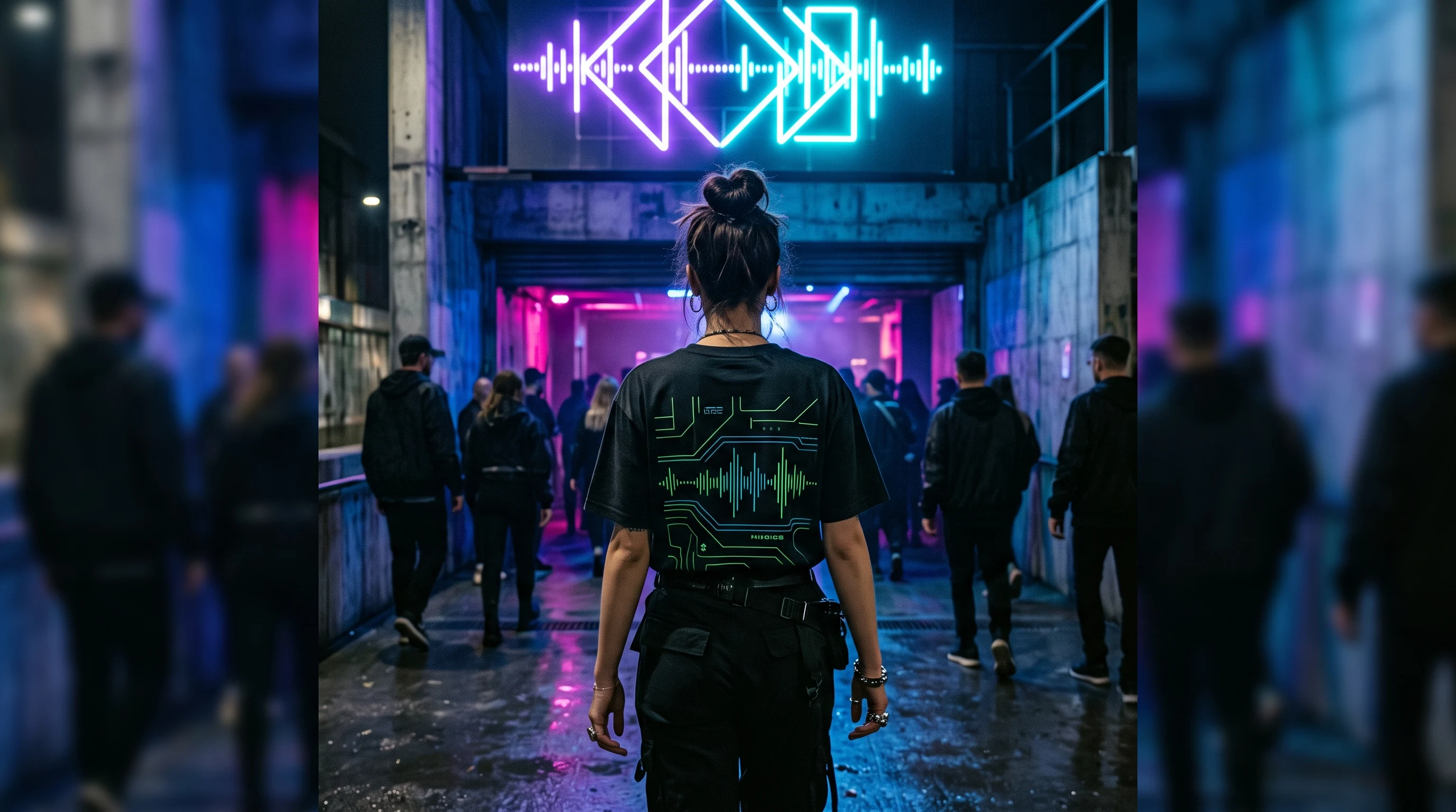
- Black ground with a neon accent: one or two glowing tones such as pink, cyan or a bright green on a dark base. Picks up the mood of the nineties and suits louder occasions.
- Painted city scene: softer, almost cinematic street art with depth and atmosphere. This variant needs area, because the composition carries the space.
If you are unsure, start with the plainest version and only add something once the picture stays too empty. The reverse route, taking things away, is harder on screen than you think.
Choosing the right shirt type
The fabric helps decide how a design comes into its own. A cotton shirt suits wearable street looks: a clear tag, a stencil or a single word sits on it calmly and works day to day. As soon as the design lives off area and saturated color, a designer shirt with all-over print plays to its strength. On the full area, a throw-up, collage or painted scene may fill the space, and strong tones stay brilliant, because the color goes directly into the fiber.
The simple logic behind it: the more reduced the design, the more likely classic cotton is enough. The more the picture uses the whole body as a canvas, the more the large-area print makes sense. An overview of the options and terms is on the pricing page.
Common mistakes that make a design look cheap
A graffiti design tips into the arbitrary for a few, always similar reasons:
- Too much at once: ten tags, three characters and a word compete for attention, and none of them wins. One striking element carries more than five weak ones.
- Too many colors: colorful collections without a coordinated palette take away the design's own character.
- Clean vector looks instead of real energy: graffiti traced smoothly loses exactly the unplanned quality that makes it appealing.
- No focus: without a clear center the eye does not know where to look.
- The wrong fabric: a large-area picture on a small chest print looks squeezed, a tiny tag on the full print area looks lost.
Keep these points in view and you almost automatically end up with a calmer, higher quality result.
Background: why graffiti works as a design
Graffiti is more than spray paint on a wall. It is a form people have used for decades to write names, attitude and belonging into public space. That gesture is exactly what makes it interesting as a shirt design: it carries a cultural code that speaks of self-assertion and expression without having to explain a word.
Unlike a brand logo, a graffiti design does not stand for belonging to a manufacturer but for an idea. The effect comes from the picture itself, not from the name above it. That fits the core of street art culture, where expression always mattered more than an official label. Anyone wearing their own design instead of a lettering seen everywhere stays closest to that thought.
Occasions and gift ideas
Graffiti shirts fit anywhere urban culture becomes visible: at concerts and festivals, in the skatepark, on a city walk through lively neighborhoods or at a street art exhibition. As a gift they work when the design suits the person:
- For someone with a reduced style, a plain stencil or a single tag on cotton is a good fit.
- Anyone who likes loud entrances will enjoy a large-area neon throw-up on a designer shirt.
- For music lovers, a pure word such as "BASS" or "NOISE" on dark cotton is a plain, personal idea.
- For a group, you can design coordinated pieces with small variations, so they belong together without looking uniform.
What matters is not the occasion itself but how well the design suits the person and the fabric. A carefully chosen shirt feels more personal than any off-the-rack piece.
Care, so the design stays strong for a long time
Graffiti designs often work with hard contrasts, so a little care when washing pays off. For cotton: wash at 30 degrees inside out, skip fabric softener and bleach, and keep it out of the dryer. Do not iron too hot and never directly on the print.
With a designer shirt with all-over print you also wash at 30 degrees inside out and leave out the fabric softener, since it attacks the fibers. Ironing is not necessary, because the design sits in the fiber. With correct care the color stays strong for a long time, even with high contrast neon tones. You will find more notes in the FAQ.
Starting your own draft
A good graffiti shirt starts with a decision, not with a full picture. Set the direction first, keep the color palette deliberately small and give the design a clear center. In the design generator you can try out different variants and compare them side by side, in the gallery you will find suggestions for mood and composition, and the exact terms are on the pricing page. Take the time to see several versions before you decide, because leaving things out is usually where the stronger design comes from.
FAQ
Am I even allowed to wear graffiti designs on a shirt?
Yes, as long as these are independently created, original designs and not photographic reproductions of other artists' works. A design in graffiti style is legally uncritical, a direct copy of a specific wall piece is not. With drafts you create yourself, you are on the safe side.
Doesn't graffiti on a shirt quickly look cheap?
That depends almost entirely on control. An overloaded design with many tags and characters looks restless, while a single strong piece of lettering on a calm ground looks grown up and considered. Reduction is the most important lever here for a high quality result.
Does a graffiti shirt also fit a quieter everyday life?
It certainly does, if you adjust the style direction. A restrained stencil or a small tag in black and white is easy to wear with jeans or under a button-down shirt. Loud neon throw-ups are meant more for concerts, festivals and deliberately eye-catching occasions.
Cotton or designer shirt with all-over print?
As a rule of thumb: the more reduced the design, the better classic cotton fits. If the draft lives off area, saturated color or a whole scene, the all-over print of a designer shirt comes into its own better, because it gives the picture the room it needs.