Designing an anime shirt: individual design ideas with style
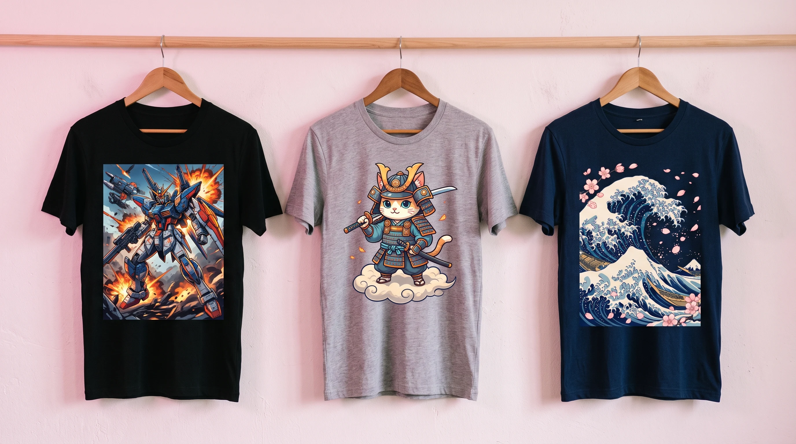
An anime shirt works best when mood, lines and color world fit together. Concrete design ideas for individual designs beyond mass-produced goods.
A good anime shirt rarely fails on the topic, it fails on the execution. Many designs look interchangeable: too full, too loud or without a recognizable direction. Yet the imagery of anime lives precisely on pronounced moods, from quiet melancholy through futuristic mecha energy to angular streetwear hardness. If you answer one question before designing, namely which atmosphere the shirt should carry, you almost always arrive at a more coherent result than someone who only takes "anime" into their head. This article shows how to turn a vague idea into a concrete, wearable design.
First the mood, then the design
Anime is not a single style but a bundle of very different worlds. Before you think about characters or colors, it pays to settle the basic mood. Do you like dynamic fight scenes with motion lines, quiet slice-of-life moments, dark masked figures or the playful lightness of the chibi aesthetic? That decision then steers everything else: line work, contrast, composition and shirt type.
A practical way in is to describe the design in a single sentence, not as a list of keywords but as an image. "A dark-haired swordswoman in falling cherry blossoms, muted colors" carries more information than ten loose terms. The more precise the mood, the sharper the later design.
Which design world suits you?
Anime-inspired designs usually start with a recognizable world. The following directions cover most of what fans actually wear:
- Action and shonen: A figure in a dynamic pose, plus motion lines and one clear focus. Lives on energy and high contrast.
- Slice-of-life: Quiet everyday scenes, soft colors, plenty of atmosphere instead of tension. Especially suited to everyday wear.
- Mecha and cyberpunk: Angular robots, neon reflections, futuristic city backdrops. Works large-scale and cinematic.
- Dark character aesthetics: Kitsune or oni masks, pared-back silhouettes, cool hardness. Close to streetwear.
- Kawaii and chibi: Playful, cute characters, friendly colors, rather smaller designs.
All these worlds come to life at Isakum in the sub-niche Anime & Manga within the category Gaming & Pop Culture. What matters is that you decide on one main direction instead of mixing several.
Ten concrete design ideas
- Shonen hero in motion: a figure in a powerful pose, motion lines behind it. Dark blue with an orange accent, a clear center.
- Mecha silhouette: an angular robot in half profile against an abstract city. Especially expansive on a black all-over print.
- Cherry blossoms with katana: a calm, Japanese-inspired composition. Pastel pinks on off-white stay restrained.
- Masked figure: a kitsune or oni mask as the graphic center. Black and red, high contrast, uncompromising streetwear hardness.
- Chibi scene: a playful character with a ramen bowl or a cat. More for quieter shirts and a young audience.
- Speed-racer aesthetic: a figure on a motorcycle in eighties style. Neon pink, cyan and black, fitting the cyberpunk world.
- Isekai fantasy: a figure with a sword before a wide landscape, warm sunset palette, told epically.
- Urban ninja: a shadow silhouette against glowing alleys. Pared back enough to convince outside the fan scene too.
- Manga panel collage: several graphic frames with onomatopoeic lettering. Deliberately dense, ideal for large-area designs.
- Pared-back symbol: a single stylized sign, an eye, a written character, a katana line, large on the chest. Maximum everyday wearability.
Lines, style and composition
Three signatures dominate the graphic execution. A pared-back, graphic aesthetic works with precise outlines and flat colors without much shading; it looks modern and sits well on cotton. A painterly direction relies instead on depth, painted backgrounds and cinematic light, and unfolds its effect above all when a large surface can carry the atmosphere. A third variant, leaning on the older cel look, brings film grain, muted colors and a light halftone screen, the familiar retro impression of early anime years.
For the composition, one simple rule applies: one main element, at most two supporting ones. If you pack mask, katana, flower, written character and dragon into a single design, you get visual chaos instead of a recognizable image. Give the main design room to breathe.
Color worlds that hold together
Color often decides the effect more strongly than the character does. Two or three main tones plus a single accent have proven themselves. A few combinations that almost always work:
- Black, red and white for dark, hard shonen designs.
- Pink, cream and turquoise for calm slice-of-life scenes.
- Violet, cyan and magenta for the cyberpunk mood.
- Indigo, orange and off-white for warm sunset images.
Avoid more than five equally strong colors, otherwise the shirt becomes restless and loses its center. If you are unsure, a look at the gallery helps: there you can see which combinations convince you most on a worn shirt.
Choosing the right shirt type
The choice of garment follows the design, not the other way round. A pared-back symbol or a simple figure comes into its own best on a classic cotton shirt; the print stays focused, the piece stays suited to everyday wear. A detailed, large-area design, a mecha scene, a cyberpunk backdrop, a dense collage, calls instead for a designer shirt with all-over print, where front and back including the sleeves become the picture surface. Here the surface carries the atmosphere, and that is exactly where a cinematic anime design unfolds its full power. A premium variant sits in between and emphasizes above all the feel, when the shirt is meant as a gift. You will find an overview of all variants on the prices page.
Three common mistakes with anime designs
The first stumbling block concerns expectation. Many start with a specific series in mind and are surprised that no licensed characters are reproduced. That is intentional: what is created here are anime-inspired designs, not copies of existing characters. That protects you legally and makes your shirt a one-off. The better way is to describe the mood instead of dropping a name.
The second mistake is overload. Too many elements compete for attention until no image remains recognizable. Deliberately reduce to one center. The third mistake lies in the color choice: anime designs in particular lose power when the palette gets too colorful. Three coordinated tones carry further than ten half-good ones.
Occasions and gift ideas
Anime designs suit very different wearers. If you stand in the middle of the scene, you will reach for loud, large-area designs with clear referential imagery, for a convention, say, where the surroundings carry a striking design as a matter of course. If you like anime but want to move more discreetly, a single symbol or a quiet scene on cotton serves you better; pieces like that also work at university or in a relaxed office.
As a gift, it is worth looking at the favorite genre of the person receiving it. A shonen fan will enjoy an energetic action design, while a more contemplative couple or cherry blossom design feels more personal when it is a gift between two people. For streamers and content creators, legibility on camera counts most: one large main design, strong contrast and calm areas, so the shirt stays recognizable even in small thumbnails. Young adults in particular have long been wearing anime designs well beyond the classic fan bubble.
Care that preserves the design
To keep an anime shirt looking good for a long time, a simple routine is enough. Wash at 30 degrees inside out with similar colors and skip bleach and fabric softener. Air dry the piece instead of using the dryer. Ironing is not necessary with the all-over print, because the color sits in the fiber; if you do iron, then only inside out on a low setting and never directly on the print. For cotton variants the same gentle wash at 30 degrees applies. That way the design stays sharp and true to color for a long time.
How to start your own anime design
Start in the Gaming & Pop Culture category and choose the sub-niche Anime & Manga or a related pop culture direction. Describe your mood in one short sentence, action-packed, calm, dark, futuristic or playful, and have several variants shown to you. Only order once character, colors and style really fit together. For a broader overview, the pillar guide to designing your own T-shirt is worth reading, and you will find related aesthetics in the gaming shirt ideas and samurai shirt ideas.
In the end a convincing anime shirt needs one thing above all: a firm idea of the mood it should carry. Once that direction is set, design, colors and shirt type almost follow by themselves. With the design generator you can develop that idea step by step, find inspiration in the gallery and compare all variants at your leisure on the prices page before you decide.
FAQ
Does an anime shirt show well-known characters from series?
No. Only anime-inspired designs are created, never copies of licensed characters. Instead of naming a character, you describe the mood and the look, a swordswoman in falling cherry blossoms for example. That keeps your shirt legally safe and a one-off.
Which shirt type suits an anime design?
Pared-back symbols and simple figures work most strongly on a classic cotton shirt. Detailed, large-area scenes such as mecha or cyberpunk designs come into their own better on a designer shirt with all-over print, because there the whole surface becomes the picture surface.
How many colors should an anime design have?
Two or three main tones plus a single accent have proven themselves. More than five equally strong colors make the design restless and take away its center. Clear, few tones almost always carry further than a colorful, overloaded palette.
How do I care for an anime shirt properly?
Wash at 30 degrees inside out with similar colors, without bleach or fabric softener, and air dry. With the all-over print, ironing is not necessary because the color sits in the fiber. That keeps the design clear and true to color for a long time.