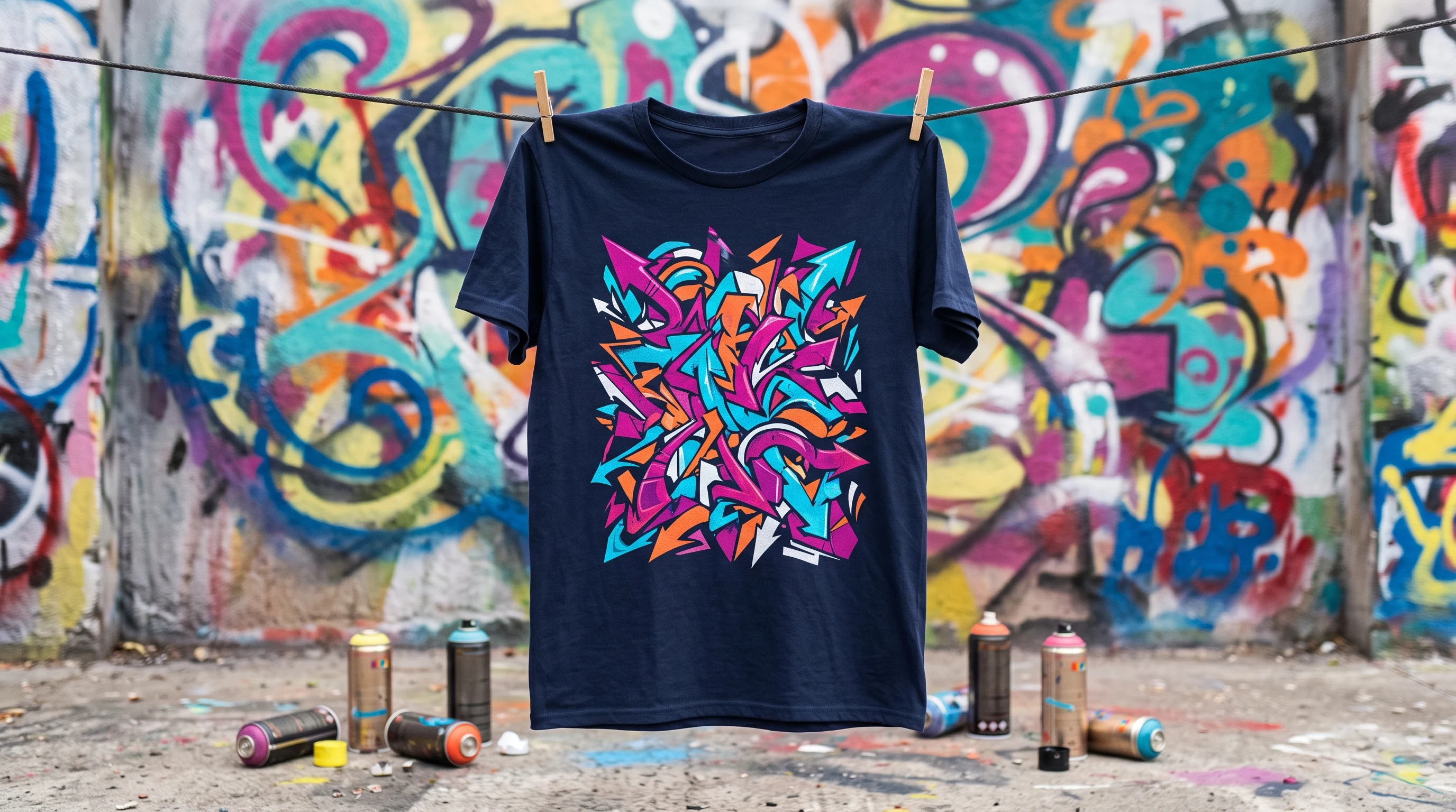
Techno shirt: ideas for club and festival designs with style
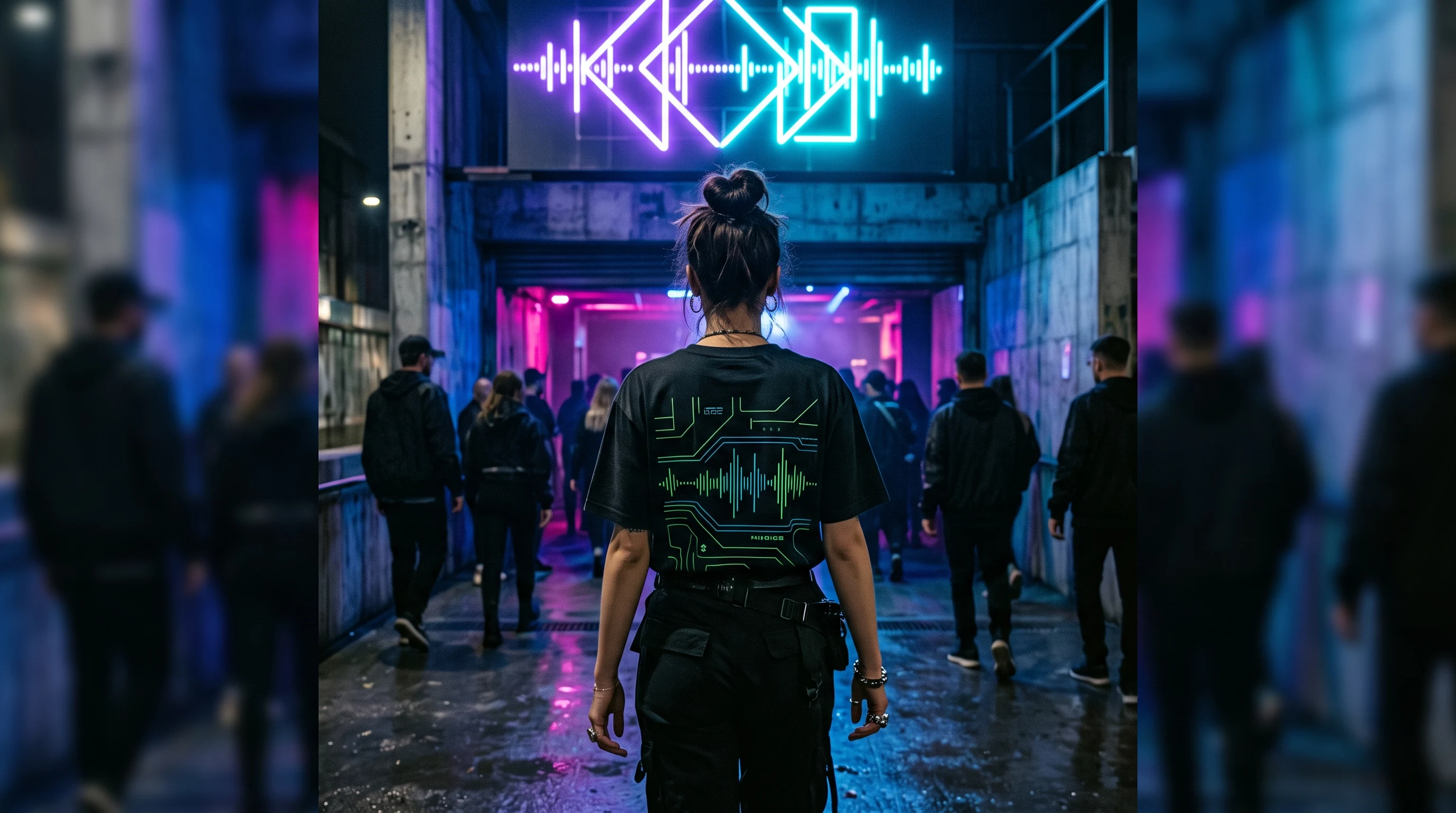
A techno shirt works with a clear club aesthetic: dark, pared back, industrial or neon. These ideas help you build rave and festival designs cleanly.
Putting techno on a shirt sounds easy: a few neon splashes, a DJ logo, done. That reflex is exactly what produces interchangeable festival merchandise. The theme becomes far more striking when you decide early which corner of the scene your design comes from and which visual language goes with it. That one decision separates a precise scene shirt from the generic rack goods you see on every second dance floor.
Four directions that carry the theme
Techno is not one uniform style, it is a spectrum, and every strand has its own visual language. Understand that and you design with more purpose:
- Pared back and geometric. A lot of black, one precise shape, a single symbol. This direction is the calmest and works far beyond the dance floor.
- Industrial. Concrete, machines, cold metal, rough textures. It points to the roots of the music in warehouses and shut-down factories.
- Neon and high in contrast. Glowing colors on a dark ground, carried by the energy of the night. Here the appearance under lights is what counts.
- Psychedelic. Flowing surfaces, gradients, hypnotic patterns that run across the whole shirt. This variant thinks big and lets the edges blur.
The more clearly you commit to one direction, the more distinctive the result. Mixed forms are possible, but they need a deliberate hand, otherwise you lose exactly the precision that makes a good techno design.
Common mistakes that weaken a design
The most typical mistake is neon chaos: as many glowing effects as possible with no recognizable hierarchy. That looks restless instead of energetic, because the eye has nothing to hold on to. A single, clearly placed accent almost always carries further than five at once.
There are two more stumbling blocks alongside that. Generic DJ or vinyl cliches look like standard goods from the festival tent, because they show no picture of the scene, only a symbol for "electronic music". And a design without inner structure misses what techno is about at its core, rhythm and repetition. A design that looks randomly thrown together can be as colorful as it likes and still stays empty.
Color worlds and how they land
The color world decides how loud the shirt is. Three combinations cover most of the theme:
- Black with one neon tone such as magenta, cyan or acid green comes across as precise and club-ready. The dark ground lets the single color glow.
- Gray and metal give the design an industrial hardness and work without garish accents.
- Rich, multi-colored neon carries festival euphoria. This palette needs the most design discipline, because without structure it tips over quickly.
A practical note for the night: designs with high contrast hold up better under changing stage and strobe lighting than fine gradients, which disappear in half-darkness. If you mainly want to wear your shirt on the dance floor, plan that contrast in deliberately.
Rhythm as a design principle
Techno lives on repetition and structure, and exactly that can be carried into a picture. An element that repeats at even intervals mirrors the music more accurately than randomly scattered effects. Think in grids, sequences and loops: a row of identical shapes that shifts slightly step by step, a pulsing geometry, a pattern with a recognizable beat.
This principle works in every one of the four directions, from the pared-back symbol to the full-surface neon design. It gives the design an inner logic you can feel even without being able to name it. That quiet order is exactly what separates a thought-through scene shirt from a pretty but unconnected graphic.
Which shirt type suits the design?
Here it is less about style than about fabric. A classic cotton shirt suits wearable club pieces with a pared-back design that also hold up in everyday life. A premium shirt shifts the focus to material and hand, when the shirt should turn out a little more upscale.
The designer shirt plays to its strength with full-surface drafts: a continuous psychedelic pattern across front and back, or an all-over print that uses the fabric completely, comes into its own here, where a simple chest print would be too reserved. Which version suits your design is something you can compare at your leisure on the pricing overview.
From the club into everyday life
Not every techno shirt has to be a loud festival statement. The pared-back, dark direction in particular wears just as naturally in everyday life as on the dance floor. A precise geometric symbol on black fabric is a quiet scene code, the right people recognize it without the shirt having to get loud.
For the night itself, the full-surface, glowing design is the one, unfolding its full effect in the dark and under lights. That range is a strength of the theme: you decide how loud it gets by choosing the design and the color world. Think beforehand about where you will wear the shirt most often, and it follows almost by itself whether pared-back clarity or full neon energy is the right choice.
As a gift for the scene
A techno shirt is a personal gift for everyone at home in club and festival culture: for a birthday, before the next weekend together, or simply as a greeting among people who share the same nights. Because the design is created individually and can be described freely, you can adapt it to what the person likes, a favorite sound, a particular atmosphere, a color that suits them. That way they wear no anonymous mass-produced item, but a piece that belongs exactly to their corner of the scene.
How to go about designing
- Settle the direction: pared back, industrial, neon or psychedelic.
- Choose the color world to match how loud you want the shirt to be.
- Decide on the shirt type, depending on whether the design should be small and calm or full-surface and loud.
- Compare several variants at your leisure before you commit.
Once you have an idea, you describe it in the design generator in your own words and get several drafts to choose from. For a first impression it is worth a look in the gallery, and you will find the different editions on the pricing page. That way, in a few calm steps, a design takes shape that really fits your night.
FAQ
Which colors suit a techno shirt best?
Black with a single neon tone such as magenta, cyan or acid green looks precise and club-ready, because the dark ground lets the color glow. Gray and metal give an industrial hardness without garish accents. Multi-colored neon carries festival euphoria, but it needs a clear structure so it does not look restless.
Is a techno shirt suitable for everyday wear?
Yes. The pared-back, dark direction with a precise geometric symbol wears just as naturally in everyday life as on the dance floor. It works as a quiet scene code that the right people recognize. Full-surface neon designs, on the other hand, are meant more for the night, where they unfold their effect under lights.
What should I watch out for in a design for club nights?
High contrast. Under changing stage and strobe lighting, clearly separated shapes and strong accents hold up better than fine gradients, which disappear in half-darkness. A full-surface, bold design works from a distance, while very fine details often get lost in the crowd.
Which shirt type suits which techno design?
A cotton shirt suits reduced, wearable designs, while a premium shirt also plays on material and feel. The designer shirt pays off above all for large-area drafts such as a repeating pattern or an all-over print that uses the whole fabric. You can compare the editions on the pricing page.