Shark shirt: from neon predator to quiet silhouette
Shark shirts can do more than teeth: silhouette, neon energy or ocean depth. Here is how a shark design gains presence instead of menace, as a one-off instead of beach shop stock.
The shark is perhaps the most underrated animal design of all. Most shark shirts show the same picture: gaping jaws, teeth, done. Yet the strength of the animal lies somewhere else, in its form. Hardly any creature has such a perfect, instantly recognizable silhouette. A good shark shirt therefore starts not with the jaw but with an attitude: elegance, energy or depth.
Three directions for shark designs
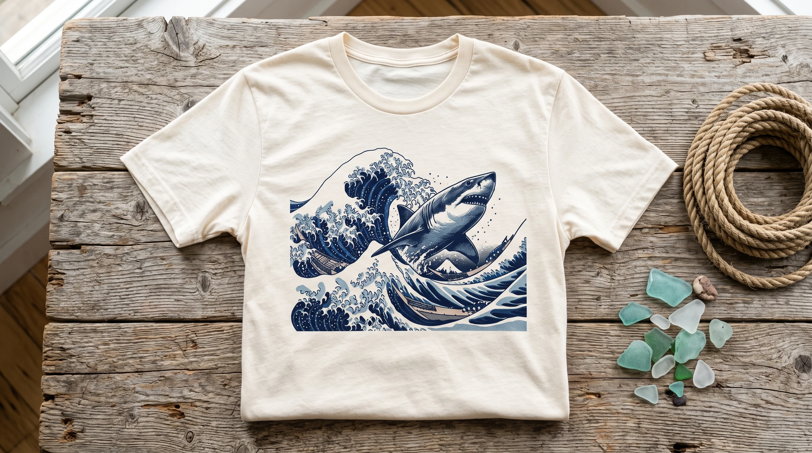
The pared-back direction uses the silhouette: one line, one shape, plenty of open space. The spindle body of the shark carries a design almost on its own, as line work, as a negative shape, as a minimalist emblem. The energy direction goes the opposite way: neon outlines, glitch effects, splintering surfaces. Here the shark becomes a streetwear statement, electric, nocturnal, loud. The third direction is depth: an ocean scene, dark blue in layers, perhaps a wave in the Japanese woodblock tradition with the predator gliding through it. It is the most atmospheric version and needs the most surface.
In the shark gallery you can see how differently the same animal can come across, from the electric neon predator to a shattered glass composition. Every design there is a one-off.
Color: the animal of the night
In design terms, sharks live on darkness. Neon turquoise, magenta or electric blue only work properly on a deep dark ground, and a neon shark on a white shirt loses half its tension. If you prefer something lighter, switch strategy: monochrome line work or a muted ukiyo-e palette of sepia, indigo and sand tones works on light fabrics too. With a shark, the choice between light and dark is not a side issue, it is part of the design.
Movement instead of pose
What sets shark designs apart from many other animal designs: they are allowed to move. A shark posing head on quickly looks like an aquarium poster. The diagonal is more exciting, an animal cutting through the frame, half cropped, on its way somewhere else. That dynamic is what separates a designed image from a photo knock-off. Here too: the jaw is optional. Menace is the cheapest effect, presence the strongest.
Placement and size
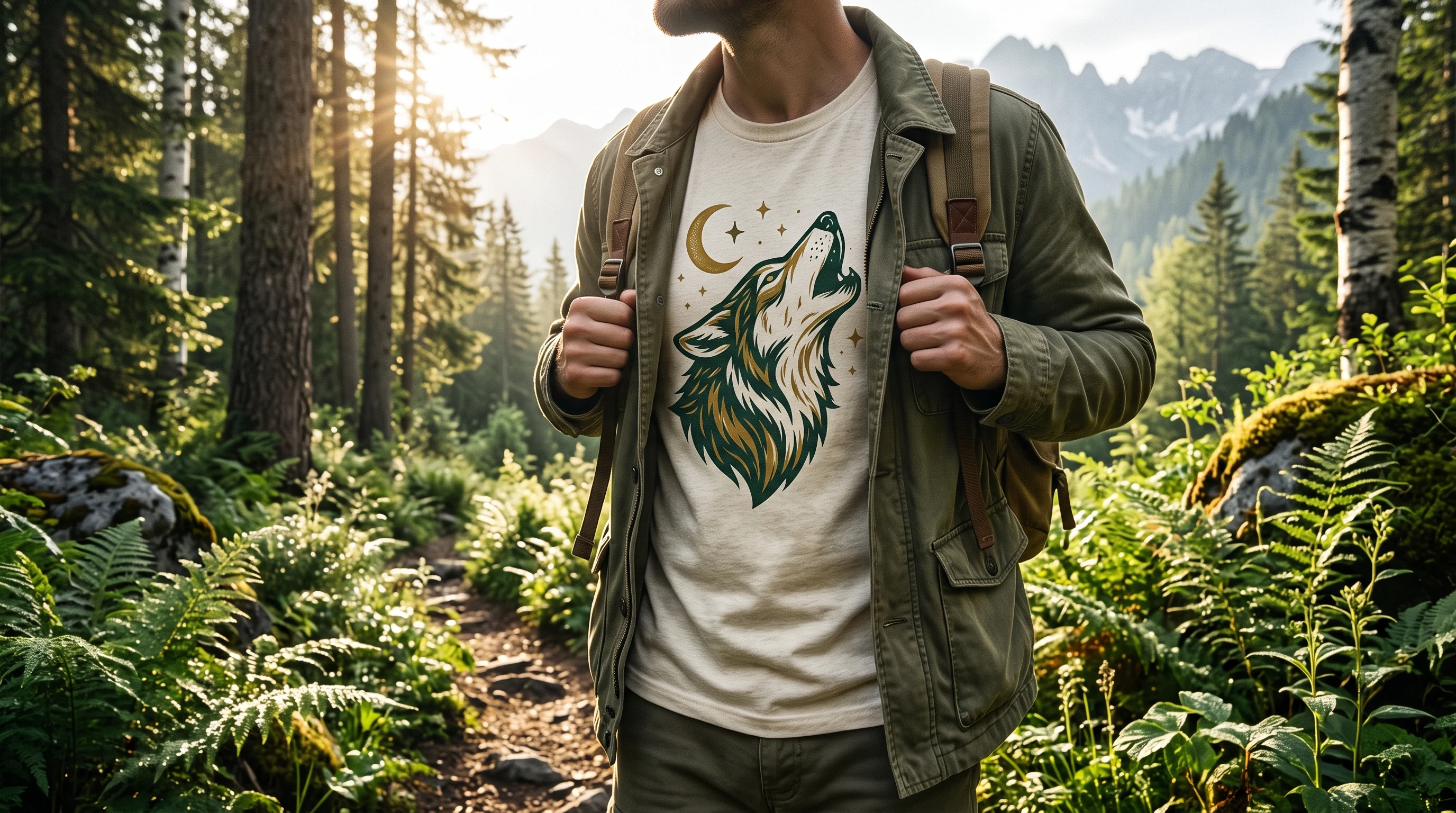
The silhouette direction works as a small chest emblem just as well as at large scale. Energy and depth designs need room, the full front or back. An elegant solution for the reserved: a small fin line on the front, the big scene on the back. If you want to carry this logic over to other animal designs: the same rule holds for land animals, take the wolf design, character beats cliché.
From cliché to one-off
The open shark mouth is in every beach shop. The other way: you describe which shark it should be, the quiet hunter in the deep, the electric predator of the night, the line in empty space, and out of that comes a design that was drawn exactly once. That is how an underrated subject becomes a shirt with attitude.
FAQ
Light or dark shirt for a shark design?
Neon and energy designs need a dark ground, because only there do turquoise, magenta and electric blue really glow. Monochrome line work and ukiyo-e palettes of sepia and indigo, by contrast, work on light fabrics too.
Does a shark design have to show the jaws?
No, that is actually the weakest version, because it is stuck on every beach shop shirt. The silhouette of the shark is so distinctive that it carries a design on its own, as a line or as a negative shape. Presence works better than menace.
Which placement suits which shark style?
The pared-back silhouette works as a small chest emblem and at large scale. Neon energy and ocean scenes need surface: the full front or back. Elegant: a small fin line on the front, the scene on the back.