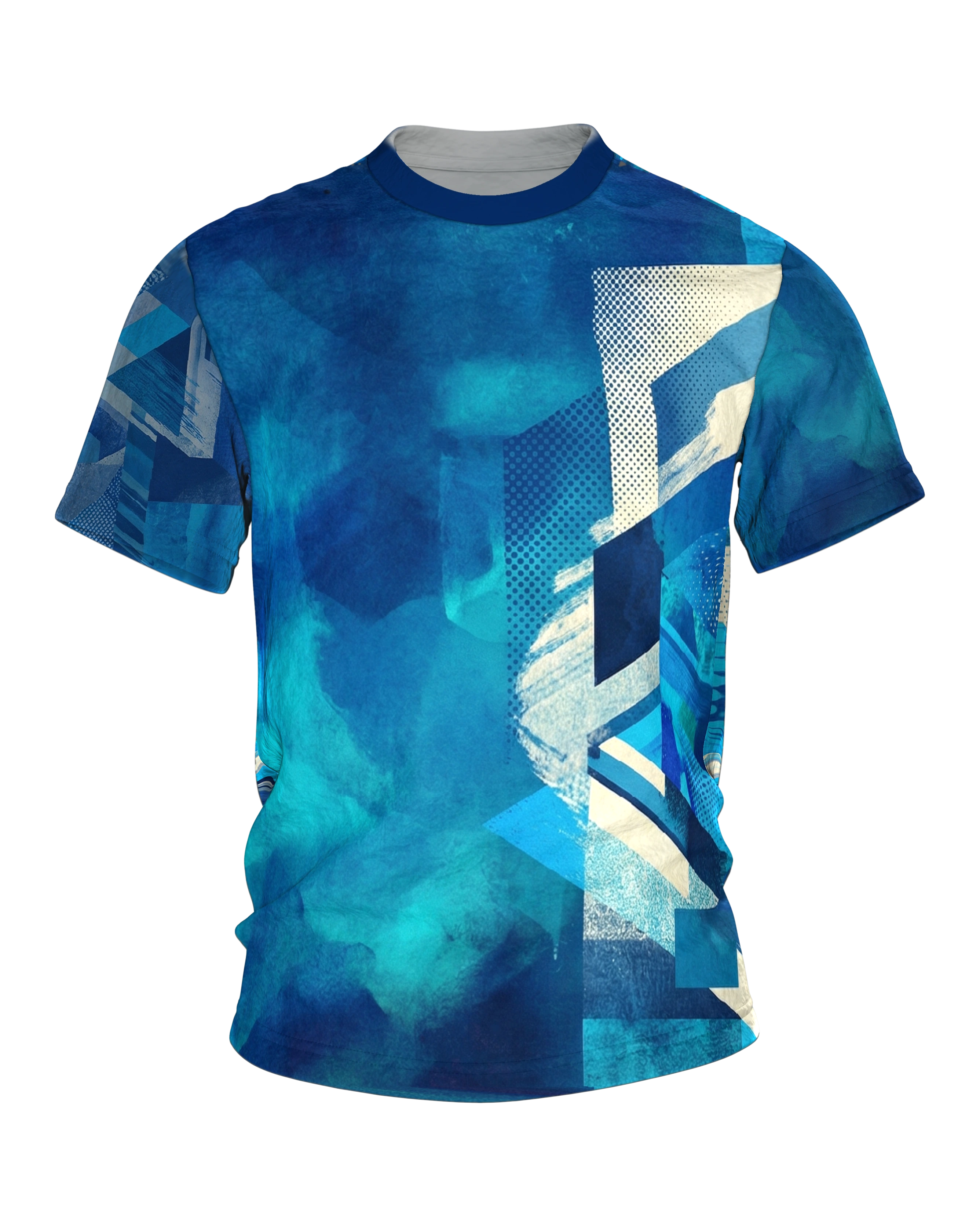
An abstract composition without a central motif. On the left, soft watercolor clouds drift in turquoise and teal; on the right, hard rectangles and triangles collide, and between them lie halftone dot grids in changing densities.
Product description
The Aqua Pop-Art T-shirt puts two temperatures of blue into a single garment and lets them meet right in the middle of the chest. The left front begins quietly. Turquoise and deep blue flow into one another there in soft, cloudy bands, shot through with pale hazy zones that lie like a rising veil over cool water. The color looks as though it had settled itself into streaks and come to rest exactly like that. Nothing on this side carries a hard border, the eye glides over the gradients without finding a fixed point, and rests briefly in the brightest places.
Toward the middle the tone tips. Out of the quiet surface grows an alert field of clear edges. Halftone dots line up across a cream-colored ground, narrow diamond bands run diagonally into the picture, dark blue blocks set firm corners, and broad cream-white brushstrokes lay themselves across it all, as if a final accent had been drawn with a steady hand. Paper-like surfaces with a rough texture fill the gaps. Where everything blurred a moment ago, a built order now takes hold, dot by dot, edge by edge.
Between the two lies a narrow strip across the chest, and that is where the real appeal sits. On the left the cool element gives way and dissolves, on the right the clear structure of grids and blocks already stands and offers a hold. The switch from one world to the other happens over a few centimeters, and still it never feels abrupt, because both sides come from the same color family. Soft and angular do not stand side by side, they interlock, until it is hard to say where the water ends and the graphic begins.
On the back the geometric side takes over completely. Cube and box edges stack into a structure that reads as isometric, almost like a view into constructed depth. Triangles and arrow shapes point in different directions, halftone grids appear in several densities, sometimes finely scattered, sometimes tightly packed. Brushstroke bands and surfaces with a palpable paper texture run between them and give the filled field a handmade undertone. The longer you look, the more small events surface, a bright wedge here, a shifted edge there, a grid field that flashes up for a moment. The eye searches in vain for a figure, and that is exactly the point.
The color world holds both sides together. Deep blue gives weight, turquoise brings freshness, sky blue opens the surface, and the cream white sets the bright pauses where the eye lingers for a moment. No tone pushes forward, all of them share the space, and the cream keeps them apart so nothing blurs into anything else. From a few steps away the whole thing reads as a calm blue picture with a lively right half, up close the second layer appears, the individual dots, the grain of the strokes, the fine transitions between water surface and grid zone.
The light plays along too. The matte paper passages swallow it, while the smoother color fields give it back, so the motif breathes a little differently depending on the angle. These small differences keep the dense right side alive and give the quiet left half something to answer.
With every turn the impression shifts between the still water side and the alert graphic part.
This is how the Aqua Pop-Art T-shirt finds its own place among the other blue motifs in the gallery. It does not live on a single image, but on this double principle, the quiet surface and the loud grid, united in one piece. The eye begins at the calm edge and ends in the middle of the movement, and in between lies exactly the tension that makes this motif what it is.