AI image generator for T-shirts: 7 criteria for wearable designs
Which AI image generator is right for a T-shirt? Resolution, composition, style consistency and color accuracy, the criteria that decide how a design turns out in print.
Almost anyone can generate an image today: one line of prompt, a browser, no software to install. Turning that into a T-shirt you really enjoy wearing is a completely different task. It is exactly on this path from the pretty screen pixel to the printed fabric surface that many providers fail. An AI image generator for fashion has to do more than produce a pleasing preview, it has to take the quirks of textile, print and garment making into account. Anyone who knows the decisive criteria can judge any solution soberly and knows what matters when ordering. The technical reference point here is dots per inch, measured in dpi, because it helps decide whether a design stays sharp in print.
This article walks through the features a good AI image generator for T-shirts should bring along, from resolution through composition to color handling. No ranking, no buying advice, just a calm inventory of what has to come together technically and visually so that an image becomes a piece of clothing.
Why not every image generation works on a shirt
An image on a monitor and a printed T-shirt are two very different end products. On screen a pixel glows under its own power; on fabric it is color pigment settling into the fibers. On a monitor 1024 x 1024 pixels looks like a lot, for a chest print that is often not enough, because at a normal print resolution a sharp design needs considerably more image points. A system optimized for small web previews therefore tends to deliver drafts that dazzle as thumbnails and come out soft or coarse in print.
Then there is the geometry. A classic image model works on a square or slightly portrait canvas. A T-shirt surface, by contrast, is not a free rectangle: it is framed by the neckline, the shoulder seam and the hem line. A design that sits neatly centered on screen quickly ends up too high or too low on the chest of a shirt, depending on the cut. Without a feel for this textile shape you get images that look badly placed once printed.
Finally there is the question of style. A generator that outputs a photorealistic wolf in the forest today and the same wolf in a comic like hand tomorrow delivers two images that do not speak to each other. On a shirt with a front and a back plus a left and a right sleeve, though, everything should play together. Otherwise the finished piece looks like a patchwork of four different hands.
Printable resolution instead of a pretty preview
The first criterion is the resolution at which the design is actually created and handed over to the printing machine. A generous chest print measures around 30 by 40 centimeters, a back print even more. To put a sharp image on that surface you need a multiple of the typical screen preview. If an application only delivers a small square and then scales it up, the traces of that scaling are often visible in print. So the sober question when comparing is: at what resolution does the image leave the generator, and is it artificially scaled up before printing?
Composition for the textile surface
A generator that is suitable for T-shirts distinguishes between the arrangements a design can sit in at all:
- Chest print: central in the upper third, compact, clearly readable from a middle distance.
- Back print: generous and broad, with room for more detail.
- All-over print: continuous across shoulders and hems, taking the seam edges into account deliberately.
What stays clear of print matters too: the area around the neckline is hardly suited to load bearing image elements, because there is little surface available there and the eye rarely wanders that way. If a generator does not distinguish between these print areas, the result becomes a matter of luck, some drafts sit well, many do not.
Style consistency across all views
A T-shirt has a front, a back and two sleeves. Anyone having a design created for all four views wants them to match: the same color world, related line work, a coherent level of detail. A system that treats every single call as an isolated task returns four images that look random side by side. Only a generator that understands the four view task as one coherent composition delivers a piece that looks like the work of one hand from every angle.
Taking material and printing process into account
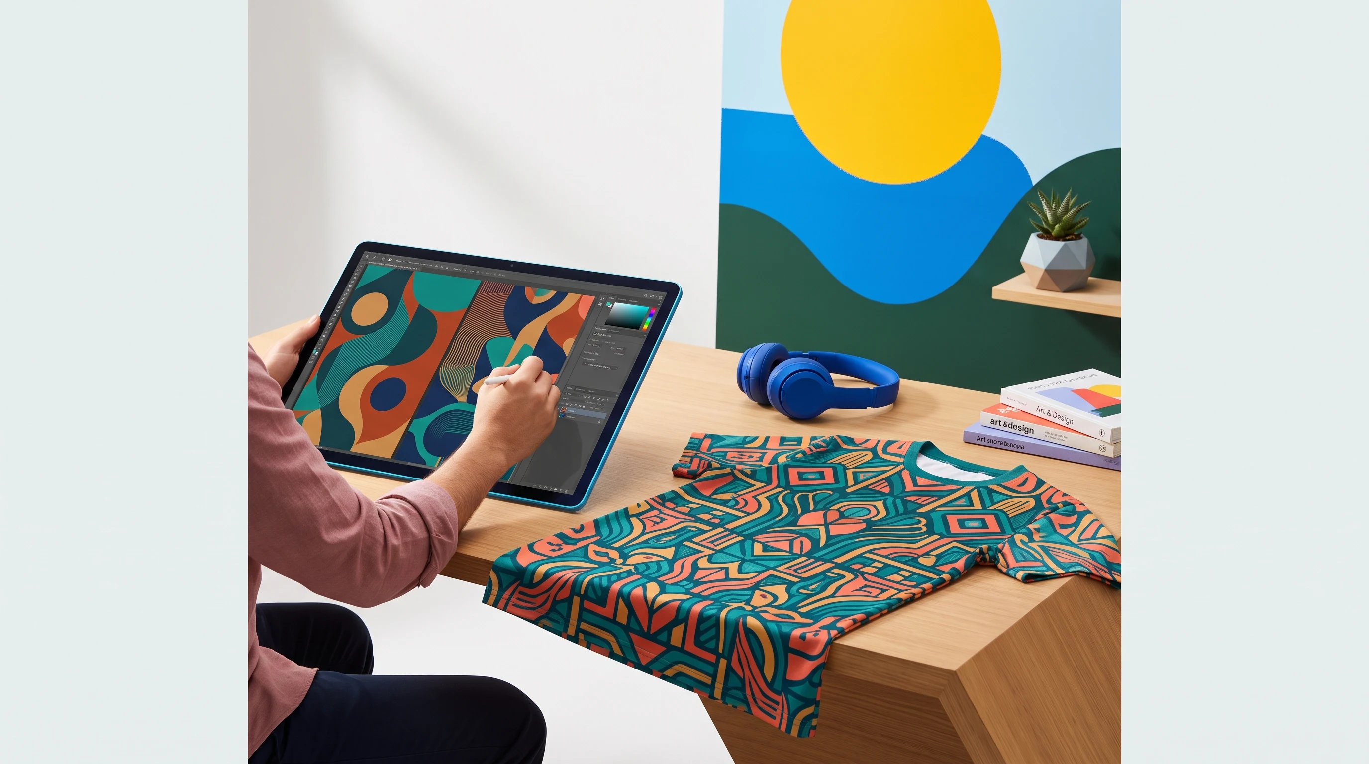
Different processes call for different image ideas. Direct printing on cotton copes well with clear lines and strong colors. Sublimation printing on polyester carries flowing gradients and continuous surfaces, but comes out more restrained on pure white. A well considered tool takes into account which process will be used in the end and adjusts line weight, contrast and area coverage accordingly. That is the fine difference between an image that only convinces on screen and a design that carries as a print as well.
Color handling within the printable range
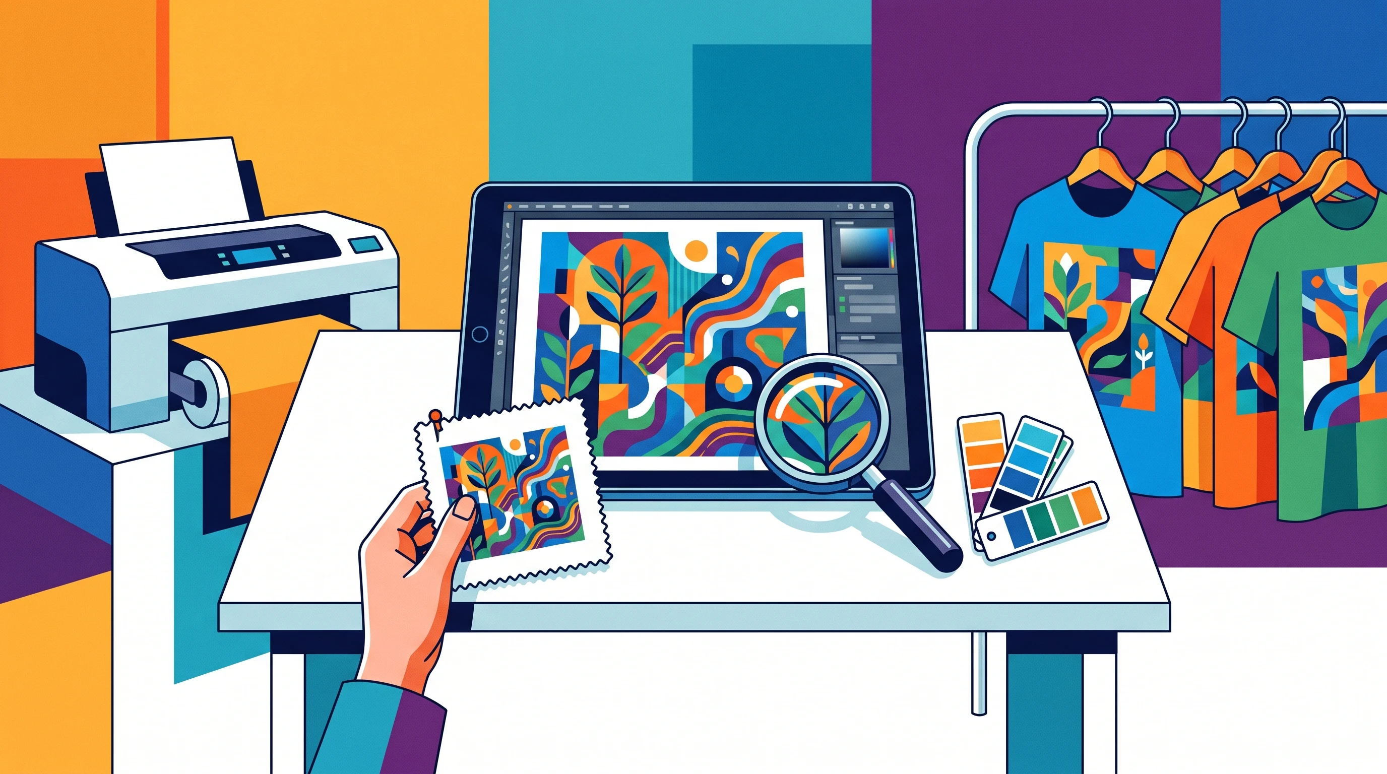
An image on a monitor is made of light and uses the additive RGB model. A printed shirt works with pigment in a different color space that does not map one to one onto the screen. Some very saturated tones, a very pure cyan or a glowing neon orange for instance, can only be reproduced to a limited extent in print and shift slightly. A generator built for textiles sticks to well printable colors from the start and avoids fine gradients that can turn into visible banding in print. A general purpose generator, by contrast, will happily deliver a magenta that prints noticeably paler than expected.
Independence of the design
AI models learn from very many publicly available images. An obvious prompt like "wolf under a full moon" therefore often leads to compositions that closely resemble one another, and potentially the results of other users as well. A system tailored to fashion deliberately counters this: through its own blend of styles and fixed composition rules, so that the finished design gets a hand of its own. If uniqueness matters to you, you can ask directly whether a draft is issued only once or can reappear any number of times.
Language understanding and prompt translation
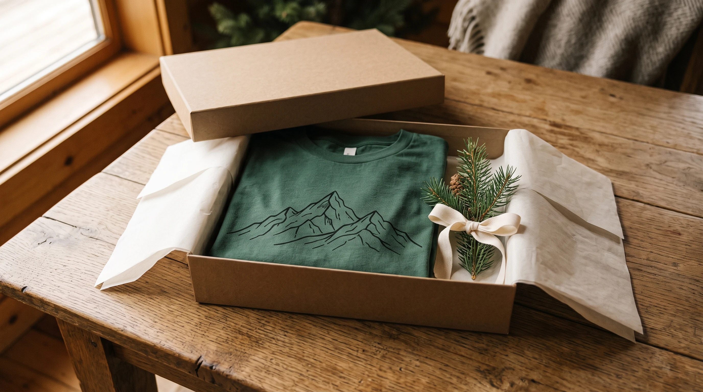
Some tools expect long, technically precise input written in specialist jargon. For most people that is unrealistic, hardly anyone enjoys writing a prompt made of fifty technical terms. A good system therefore accepts everyday language in your own words, works out what is really meant, and translates the wish into clean design instructions in the background. Even a short sentence like "something with mountains, calm and pared back" should lead to a usable draft instead of failing on the input.
How to judge a provider as a buyer
A few simple observations help with the assessment:
- Do the works on show really look different, or do the same building blocks keep coming back?
- If you generate several variants for the same wish, are they independent drafts or just slightly shifted versions of the same image?
- Can you order a piece in the end and check on your own body how fit, print and fabric come together?
The most honest verdict comes not from the preview but from wearing it. A design thrown together quickly on some random shirt stays arbitrary. You recognize a carefully created, cleanly printed piece only once it has been worn and washed a few times and still convinces.
If you want to try the step from image to shirt yourself, the design generator is the way in, the gallery shows designs already made, and the terms can be read at your own pace on the pricing page.
FAQ
What resolution should an AI image generator deliver for a T-shirt?
What counts is the resolution at which the design is actually handed over to the print, not the size of the screen preview. A chest print of around 30 by 40 centimeters needs a multiple of a small preview square. If a tiny image is only scaled up afterwards, the traces of that scaling are often visible in print.
Why do some AI designs look different in print than on screen?
The screen mixes colors out of light in the RGB model, print works with pigment in a different color space. Very saturated tones like pure cyan or glowing neon orange can only be reproduced to a limited extent and shift slightly. A generator built for textiles therefore sticks to well printable colors from the start.
What does style consistency mean on a shirt with several print areas?
A T-shirt can be printed on the front, the back and both sleeves. Style consistency means that these views share the same color world, related line work and a coherent level of detail. If a generator treats each surface as a separate task, the parts look random side by side instead of like the work of one hand.
Do I need to know technical jargon to describe a good design?
No. A well considered system accepts everyday language in your own words and translates the wish into design instructions in the background. Even a short sentence like 'something with mountains, calm and pared back' should lead to a usable draft, without having to write a long prompt made of technical terms.