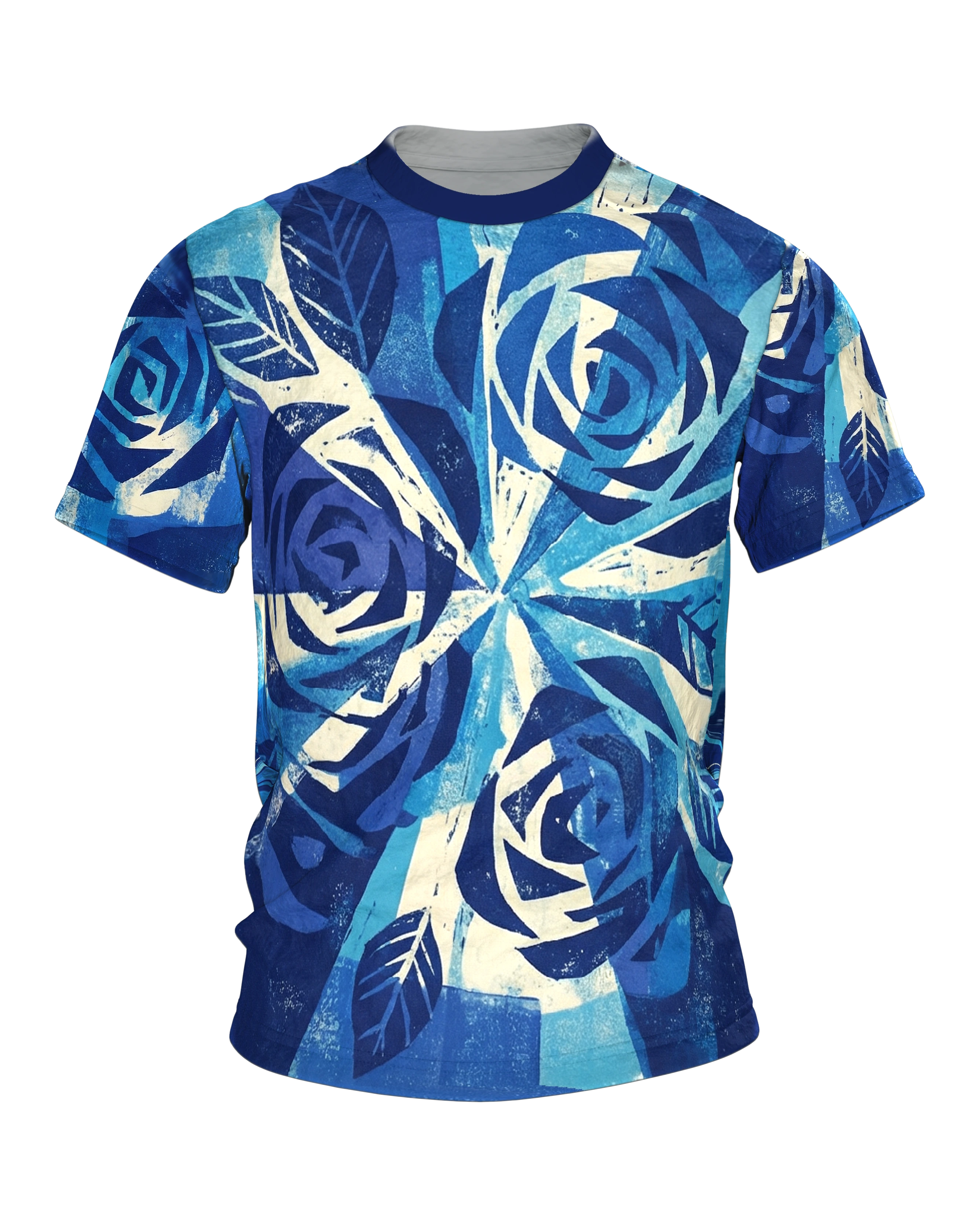
White linocut rays shoot radially outward from a central point, like a constructivist poster from the 1920s.
Product description
The Radial Rays T-shirt carries a halo of rays on the front that breaks out from a single point in the middle toward every side. From this center broad bands run radially outward, alternating in navy blue, cobalt, light blue and cream white, so that the whole surface seems to vibrate. The color sits blotchy and uneven on the light ground. The edges stay rough, and the grain looks as if it came off an ink roller. In some places the blue covers rich and dense, in others the cream-white base breaks through and makes the bands look almost translucent. It reads like a sheet from a printmaking workshop on which light and structure gather in clear shades of blue.
Across this radiant ground, three large rose blooms are spread over the front, stylized in angular, flat shapes as if laid out with a few decisive cuts. The first sits above the middle, offset to the right, the second at half height on the left, the third below in the right half of the image. Each bloom is held in dark navy blue, while the inner coils shine through in a lighter blue, so that the spiral form of the petals stands out clearly. Between them lie several jagged leaves with bright veins that look like negative shapes carved out of the ground. The rays do not break off at the blooms but continue behind them. That gives the design depth and makes the flowers look like applied marks.
So the eye finds the center first and then follows the bands outward. In the end it catches on the blooms, which interrupt the beat of the surface. This order of movement and resting points makes the front lively without becoming restless. Everything stays inside a single color family, which gives the strong blue a cool, concentrated effect and underlines the graphic character even more. Look closer and you find fine streaks and gaps in the rays that give the image the charm of a freshly pulled print.
The back strikes a different tone. Here there is no halo of rays but a grid of rectangular color fields that look like stamps set side by side or lengths of fabric lined up. Each field has its own shade of blue, from deep navy to pale sky blue, and carries the same blotchy texture as the front. Four more rose blooms lie on this calm grid ground. A smaller one sits at the top left, a large one at the top in the right half. A third stands on the left at middle height, the fourth below and to the right of center. Single leaves settle between the blooms and connect the fields to one another.
This creates the impression of one coherent sheet. On the front the surface is in motion. On the back the same motifs lie ordered on their tiles, as if the theme had been played through twice. Both sides speak the same language of blue, cream and printed texture, but choose different ways of telling it. It is exactly this change that keeps the design interesting across both sides.
The design is laid out as a fixed artwork and appears the same on every piece. That includes the roughened roller texture. It is drawn, not left to chance in the fabric. Anyone who knows the appeal of linocut and monotype will find a whole visual world here in a single color. It swings between ornamental calm and graphic tension.
The strong blue comes across especially clearly on the light ground and goes with jeans just as well as with plain, dark tones. Because front and back each carry their own image, the shirt stays interesting from every viewing angle and needs no further ingredient to stand out. Anyone who likes graphic motifs with character and values blue as a color with an attitude will soon reach for it first in the closet.