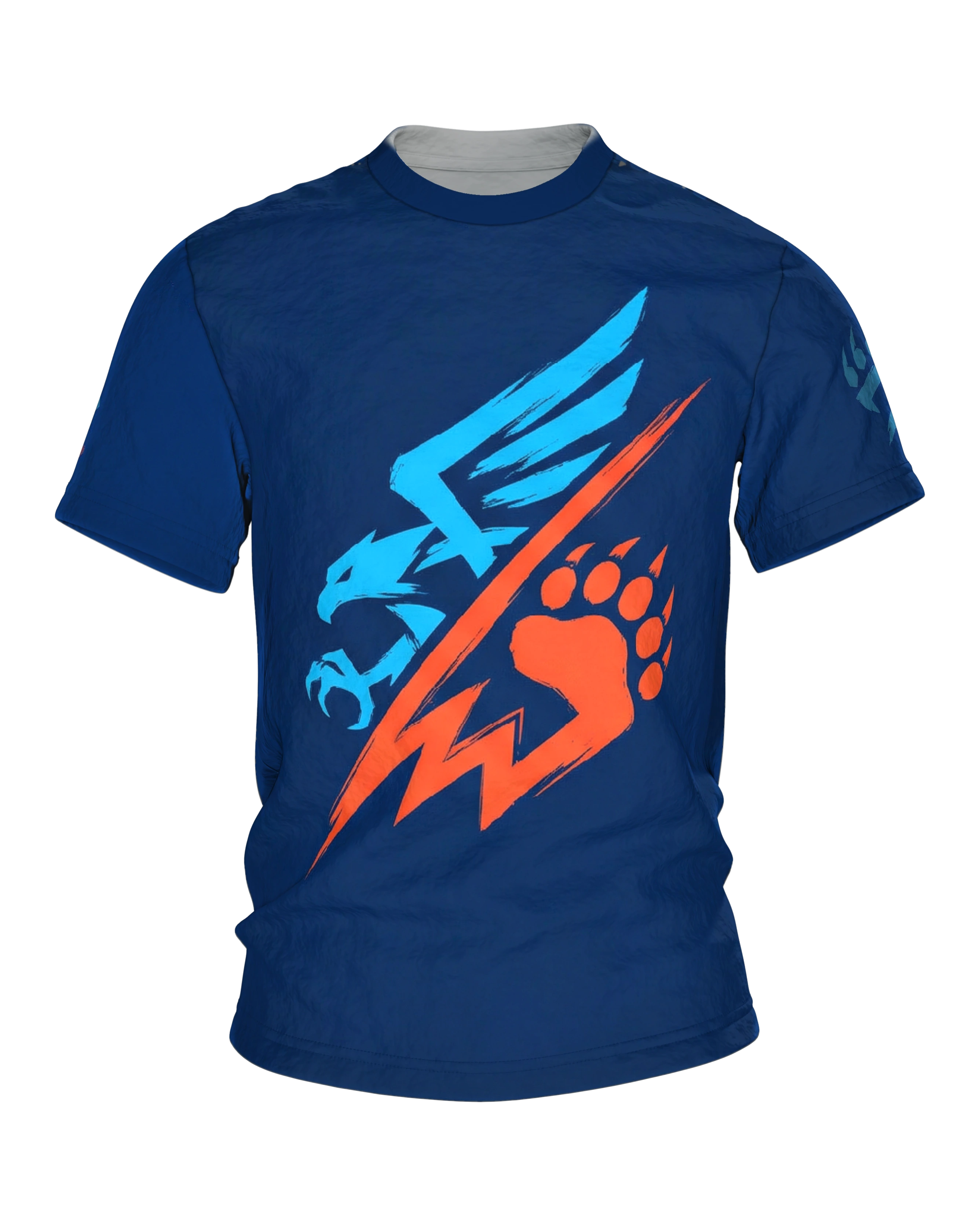
A minimalist sports mascot logo in the style of a college crest. On the left stands an eagle silhouette in bright cyan blue, with a single raised wing and a closed hooked beak.
Product description
The Eagle Bear Clash T-shirt shows a compact emblem on deep navy blue in which two camps meet in exactly two bright colors. The base tone is a dark navy that lets both signal colors step forward clearly, a cool light blue on one side and a warm orange on the other. Before your eye has taken in all the shapes, the message has already landed: two sides are fighting over the same surface. Nothing about this presentation wants to reassure, everything wants to challenge.
On the left stands the eagle in light blue. Its head is turned to the left in profile, the beak tapers to a point, and a single wing is raised high and fanned out, as if frozen in mid-movement. Below the head, open talons grab into empty air, tensed and ready to seize. The whole figure is drawn with a dry brush, its edges fray, so every line looks torn rather than cleanly painted. That gives the cyan side a nervous, quick energy, like a player waiting for the opening whistle.
A bolt of orange flashes across the middle, coming from the upper right and tipping down to the lower left, running out in a jagged end. This stroke is the dividing line and at the same time the moment in which both sides touch. It keeps eagle and paw apart and binds them together in the same move, because without this tear there would be no opponent. This edge is what decides how the whole image is read.
On the right the paw answers. Five claws stand at the top, below them sits a powerful pad, all in the same orange as the bolt. Only the paw is shown here on purpose and not the whole animal, because a single sign is enough to name the second camp. Where the eagle bets on speed and sharp angles, the paw stands for force and a firm stance. Two temperaments, one surface, and in the middle the orange tear that keeps both under tension.
The design follows the language of a club crest. Cyan against orange, clear contours, no in-between tones, a structure that stays instantly readable even from several meters away. It does not depict a nature scene, it stages a duel like the kickoff between two teams that wear their colors and have already picked their side. That is exactly the appeal: while looking, you almost unconsciously decide who you are for. That quiet invitation to take a position carries the shirt through the whole day.
On the back the theme returns in a calmer form. In the center sits a single large paw in light blue, five toes with claws, and the pad is laid out as an open, curving shape that leaves air inside. Directly below it lies a short orange brushstroke like an underline that closes the sign off cleanly. After the loud confrontation on the front, the back reads like the mark that follows, the shorthand by which the allegiance can be recognized from behind as well.
Front and back each carry their own image, so every view holds a complete statement of its own. The sleeves do not stay empty either, the paw repeats there in small format, together with the slanted orange stroke beneath it. Four surfaces, the same allegiance, only spoken at a different volume each time. In daily wear, too, the emblem keeps its bite.
Anyone who likes team aesthetics, clear symbols and a hint of competition will find an emblem with attitude in this piece. It was designed as an independent sign, with invented colors and freely drawn shapes that copy no real club crest. It is a shirt for people who wear their rivalry with a wink and still mean it. Two opponents, two bright tones, a tear between them, and the quiet question of which side you are on.