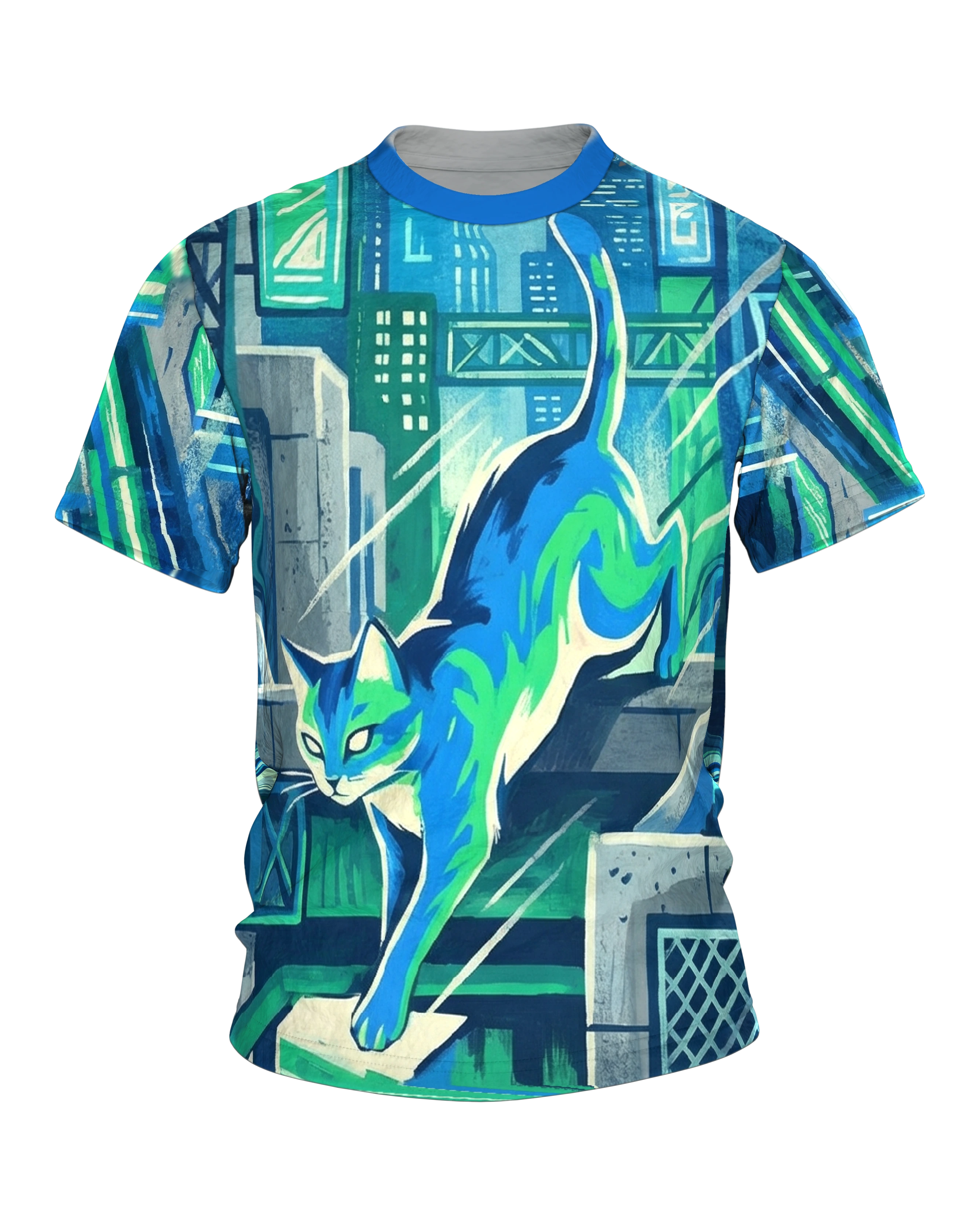
A blue-green cyberpunk cat prowls across an industrial platform, behind it a glowing cyber city skyline with glass facades and bridge structures. Entirely in a cool-tone scheme, with cream white as the only source of light.
Product description
The front of the Cyberpunk Cat T-shirt shows a blue-green cat dropping head first off a concrete ledge into the canyon of buildings. The tail stands high and upright, the body stretches out in the movement. The front paw is already landing on a bright, flat slab, as if the landing had long been planned. Everything is laid out in a gouache style, with visible brushed fields instead of smooth vector edges, so that every area keeps a light texture. The colors stay tightly held: a deep blue for shadows and body, plus a fresh green in the markings of the fur. Mint and a warm cream white lift the cat out of the dense background.
Behind the animal an invented metropolis is layered back into the distance. High-rises carry grids of small, brightly set windows, lattice masts and bridge girders cross each other. Signboards with stylized characters hang on the facades. They look like a foreign script without ever forming a real word. Some windows are only hinted at as small dabs of color, others bundled into whole blocks, which benefits the depth of the picture. Fine diagonal strokes lie over the scene like rain and give the air a cool, damp movement. The eye travels from the leaping cat upward to the towers. Then it is led back down to the bright slab where the landing is about to happen.
On the back the same cat walks on in profile. Calmly and surely it sets paw before paw on a narrow walkway strung between two buildings, a steel girder high above the alley. Behind it a nocturnal city canyon opens up in dense blue. In it stand a curved arch bridge and staggered towers. Added to that are two lamps and green signs on the walls. One sits on the left as a globe on a mast, the other hangs on the right on the building wall and sends a flat beam across into the haze. The haze between the buildings makes the rows further back softer, while the cat remains the clearest shape in the picture. This creates a second, slower moment that answers the leap on the front, as if the animal had simply carried on along its way across the rooftops.
Front and back motifs are tuned to each other and work with the same blue-green, the same brush handwriting and the same city. Wear the shirt and you take both scenes along: the bold plunge downward and the composed balance up high. The painted character deliberately sets the motif apart from hard neon graphics. The light in the windows and signs is set as color, not as a glaring effect. That makes it feel more like the memory of a night in the city than like a screen. As a result the motif stays pleasant even when you wear it often, because it does not dazzle but holds a mood.
The front is built on a single diagonal. The leap runs from the top right to the bottom left, from the high-stretched tail to the paw on the bright slab. Front and back each carry their own picture, reaching right to the edges of the surface and keeping the figure clear in front of the backdrop. The colors are chosen so that the cat remains instantly recognizable as the main figure even from several meters away. The city only gives up its many small details on closer inspection.
The motif suits everyone who likes cats and at the same time appreciates science fiction, painted illustration and calm streetwear. Both sides together make up a short nightly round. That makes the shirt feel less like a single picture and more like a short prowl you carry around with you. It works in everyday life just as well as on a long evening in the city, and it would rather tell a quiet story than just place a logo.